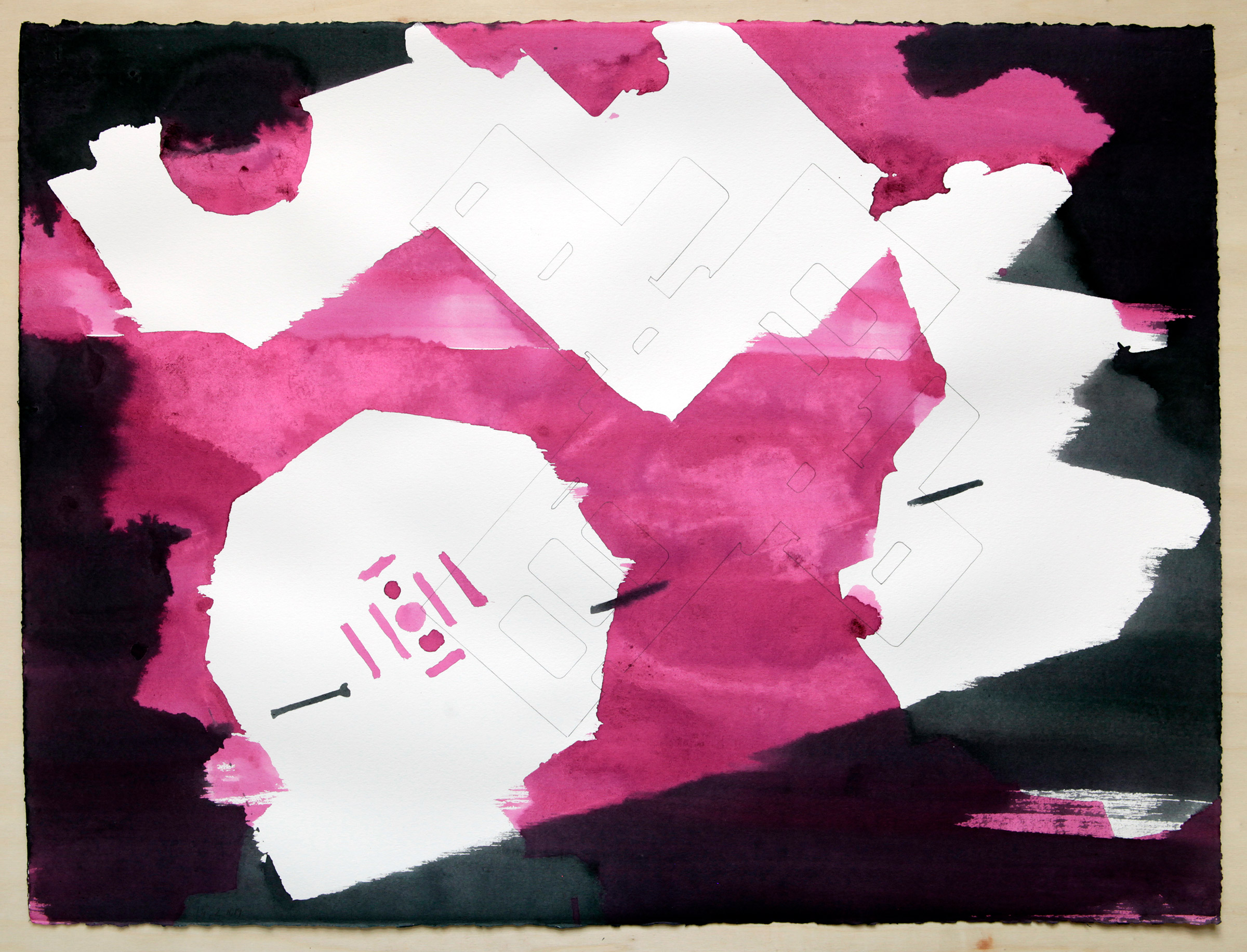
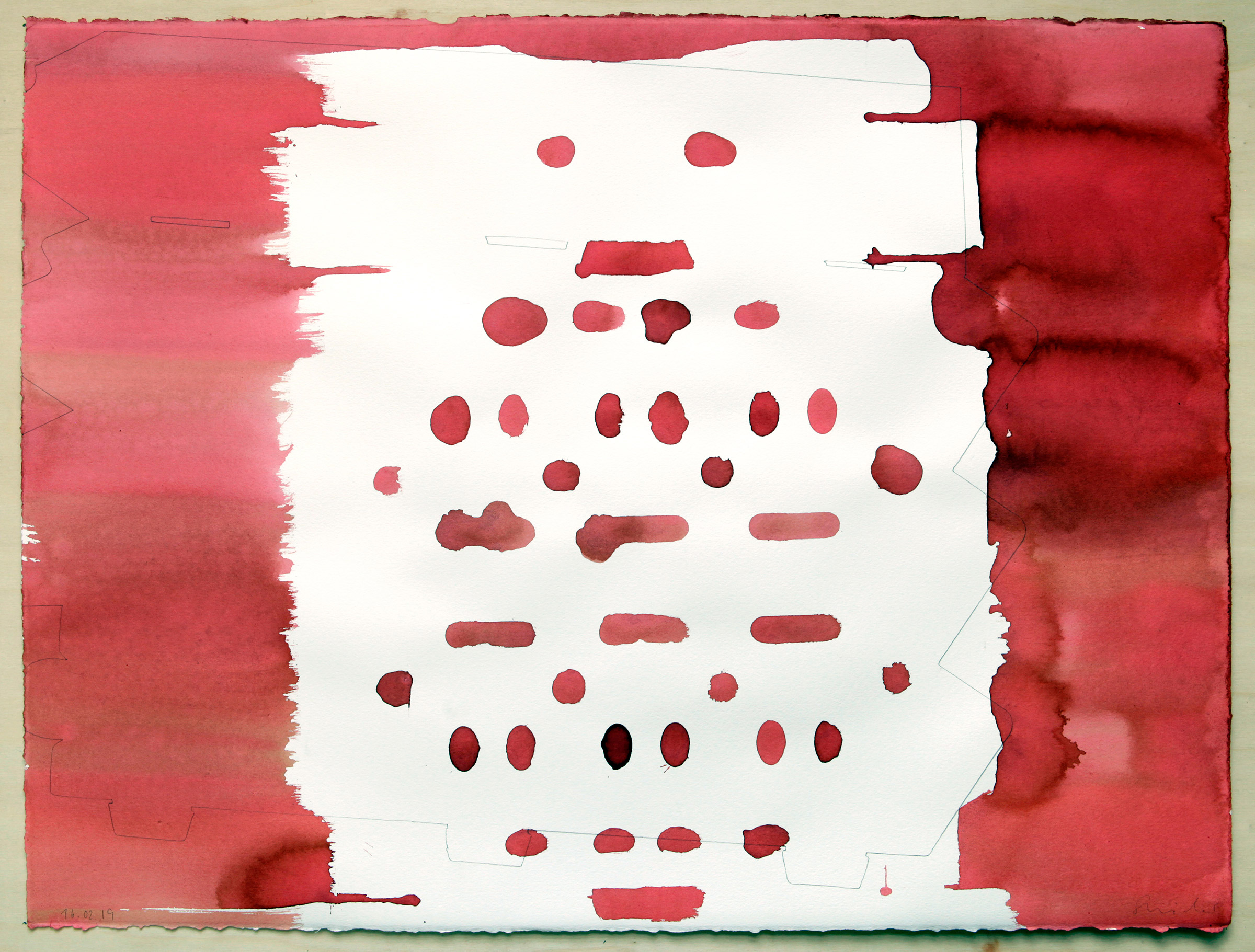
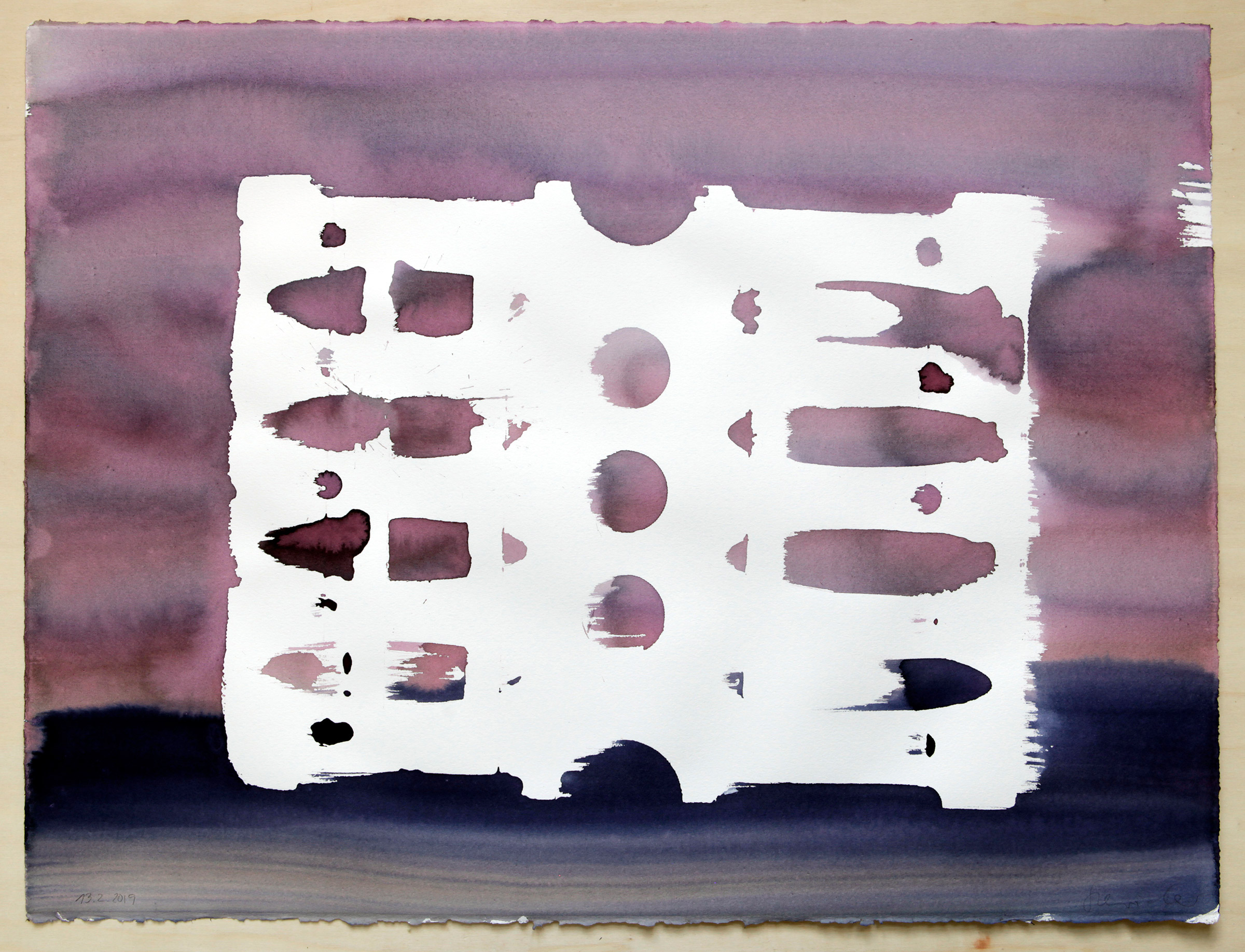
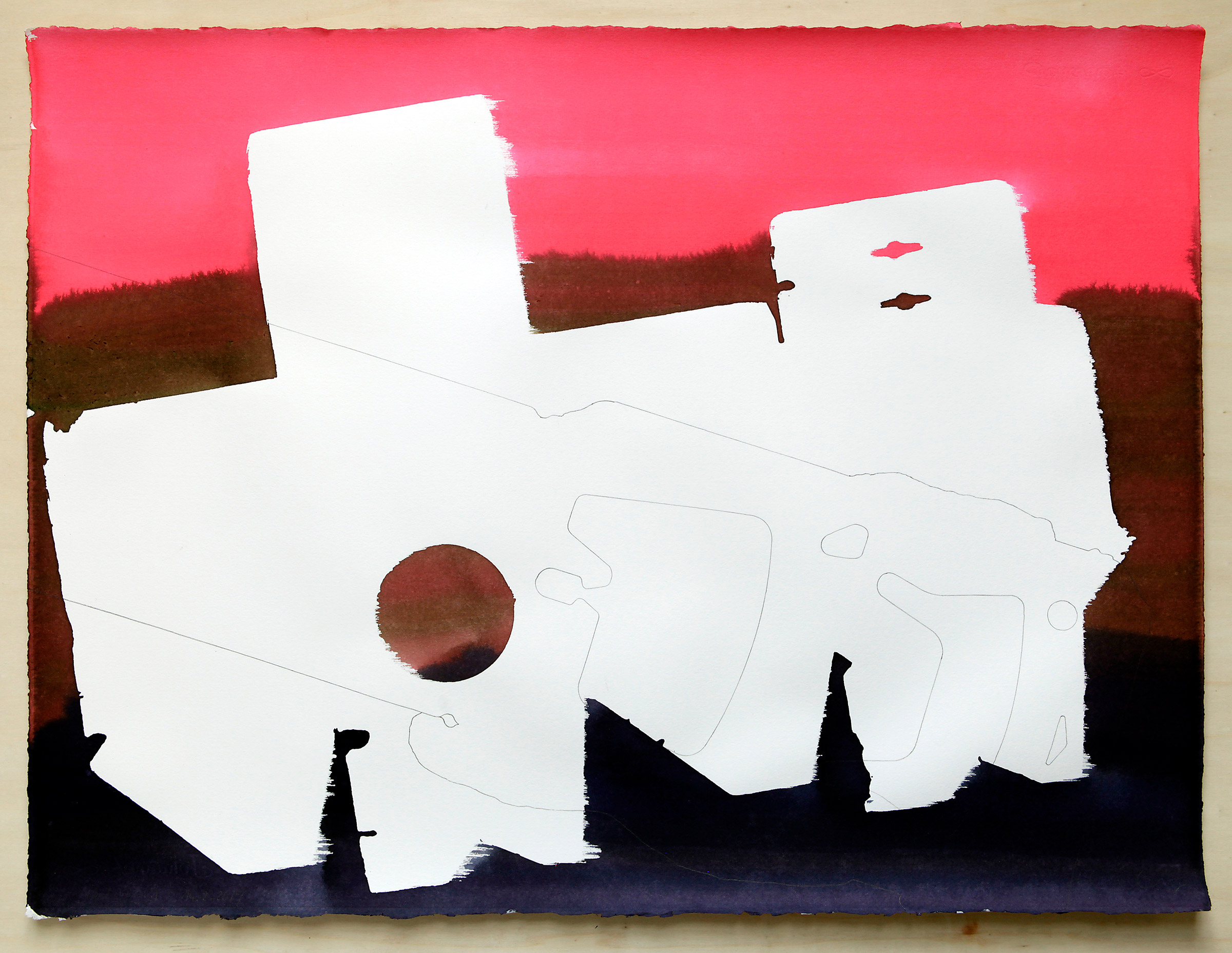
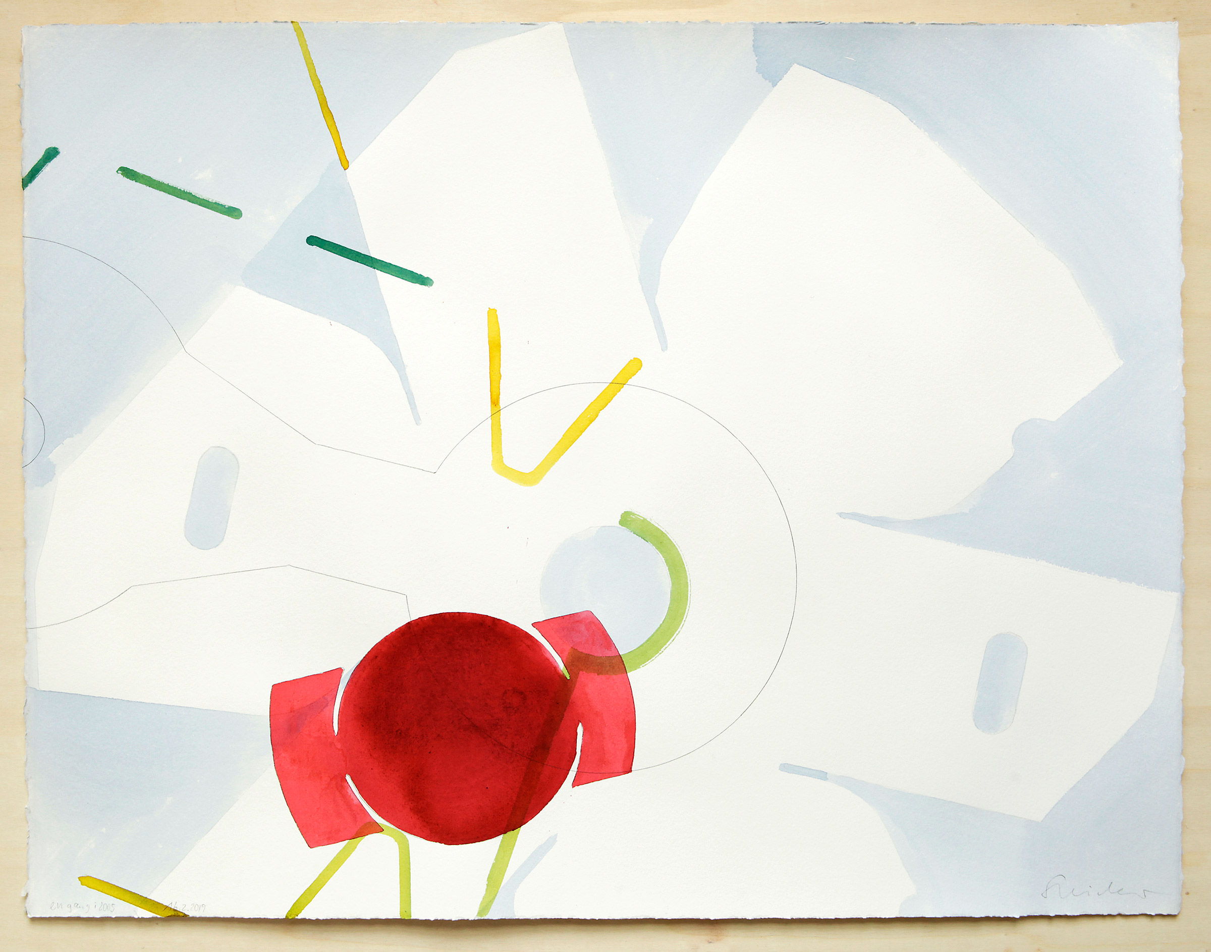
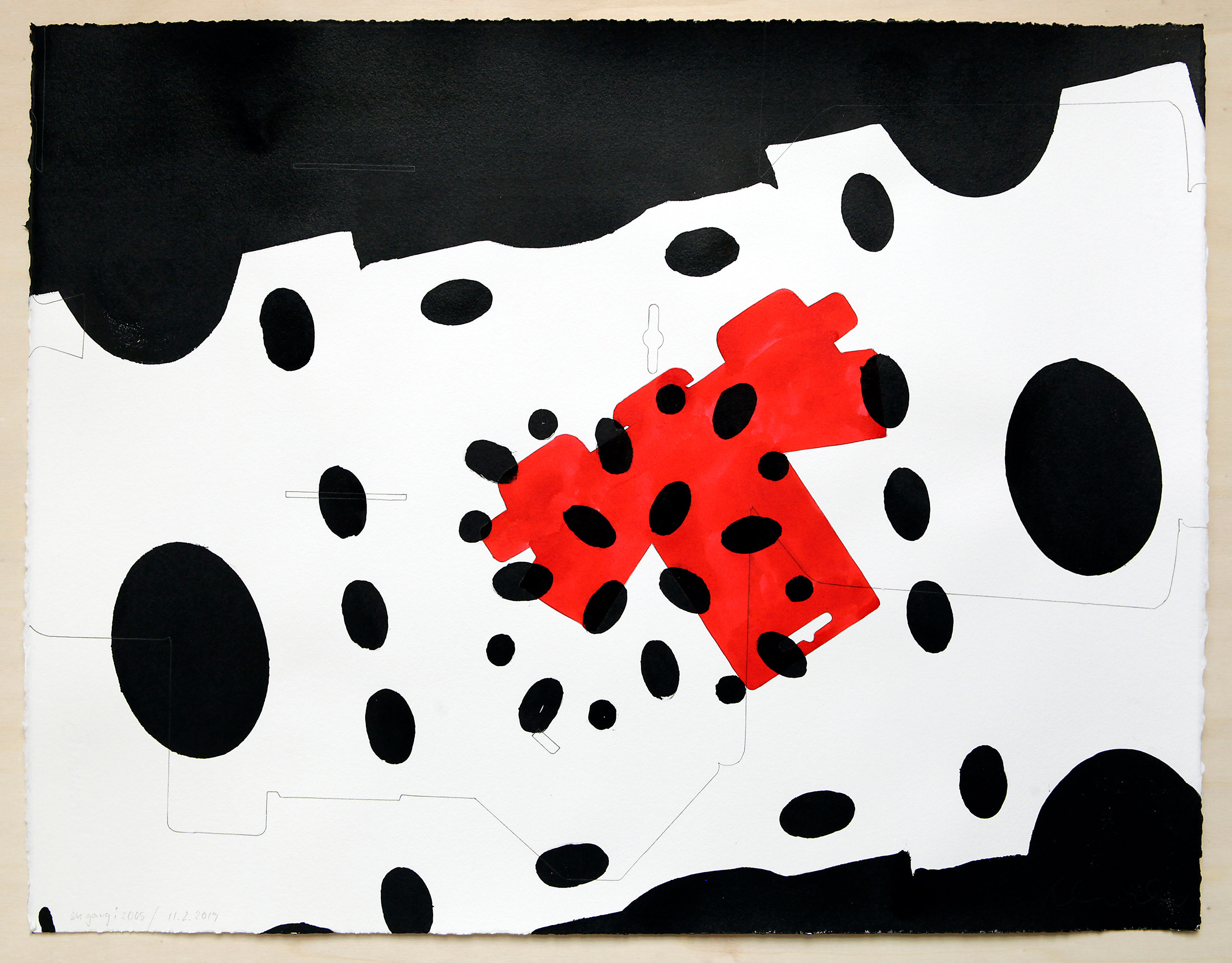
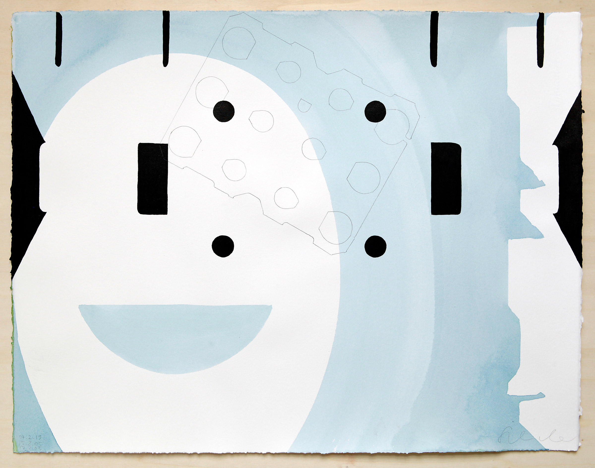
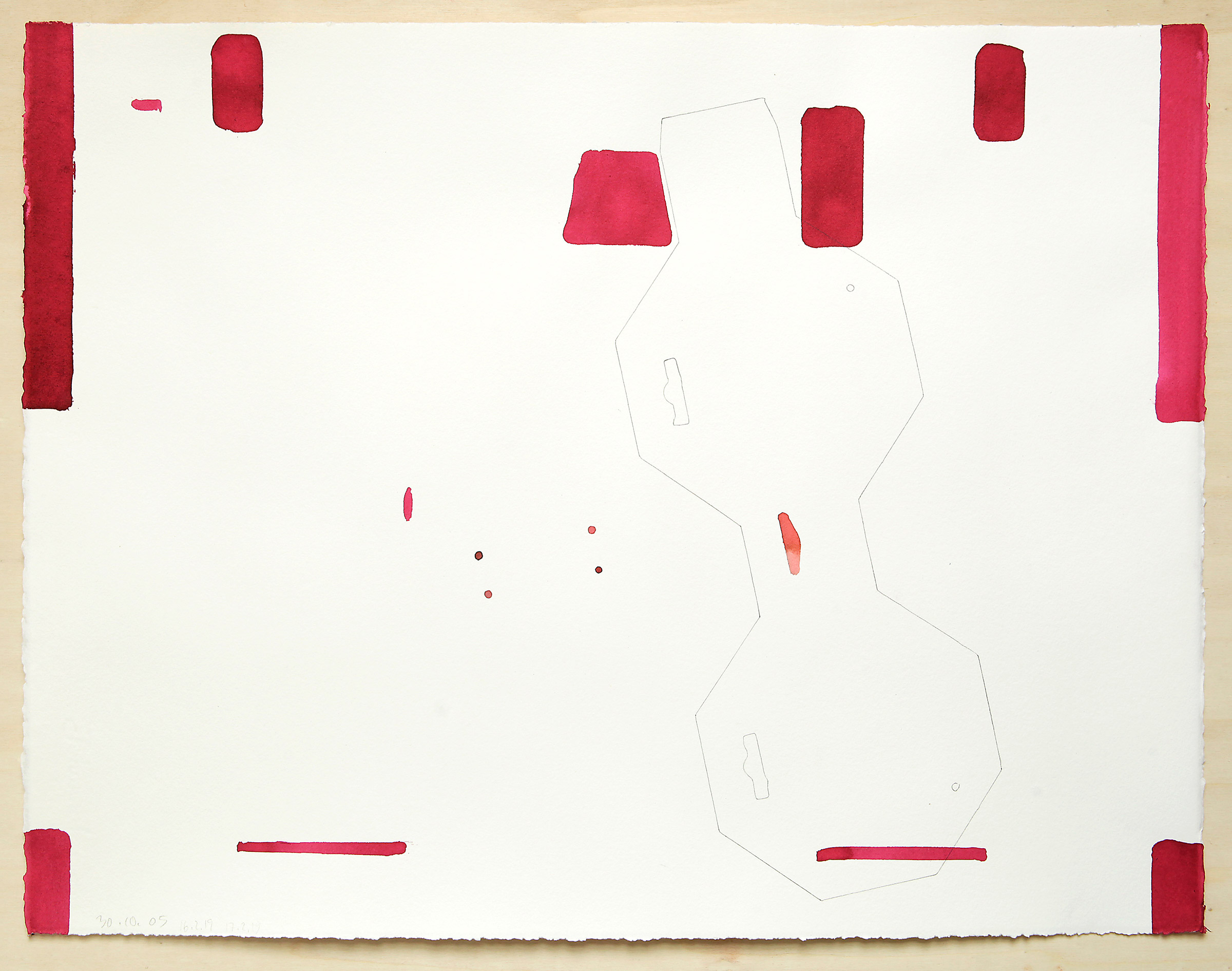
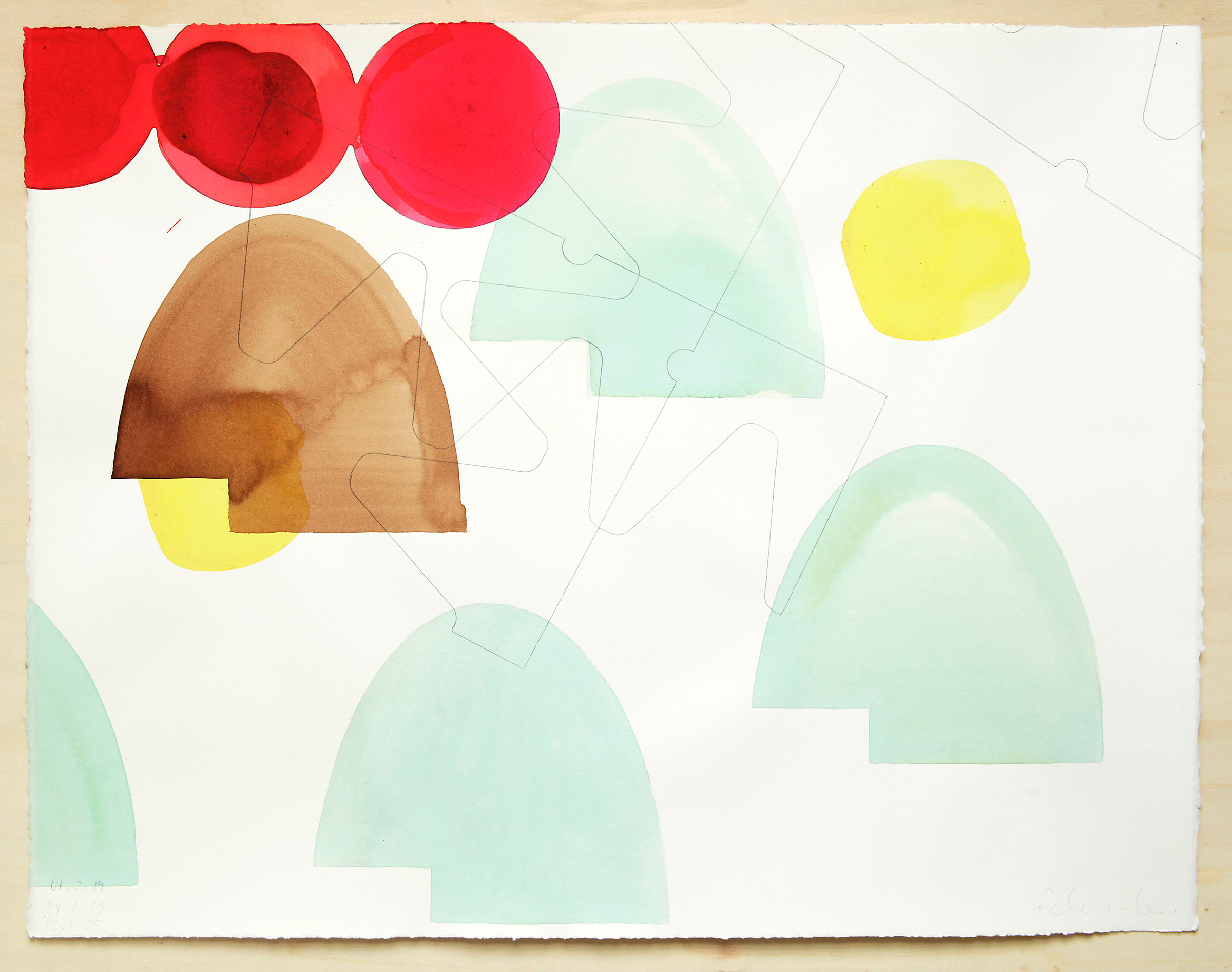
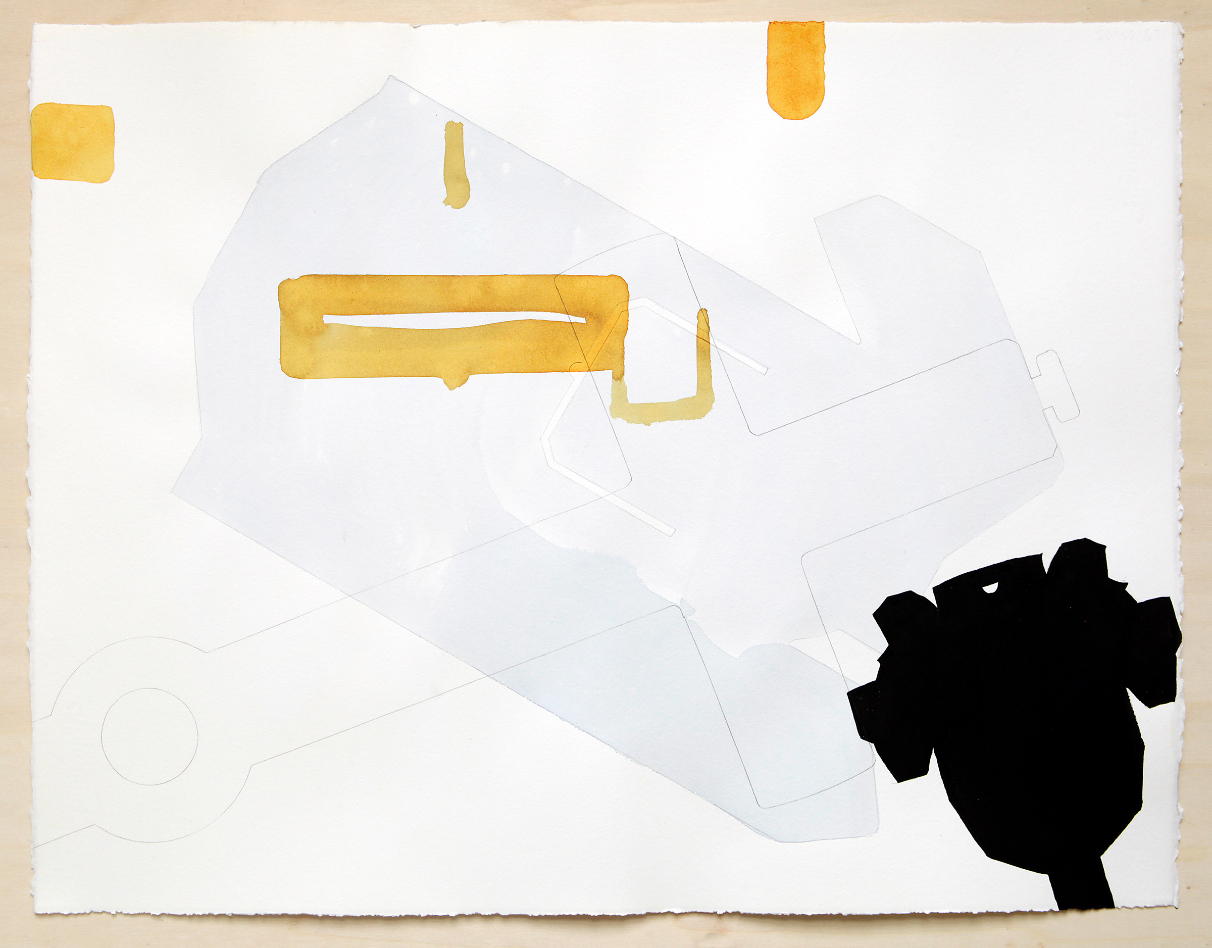
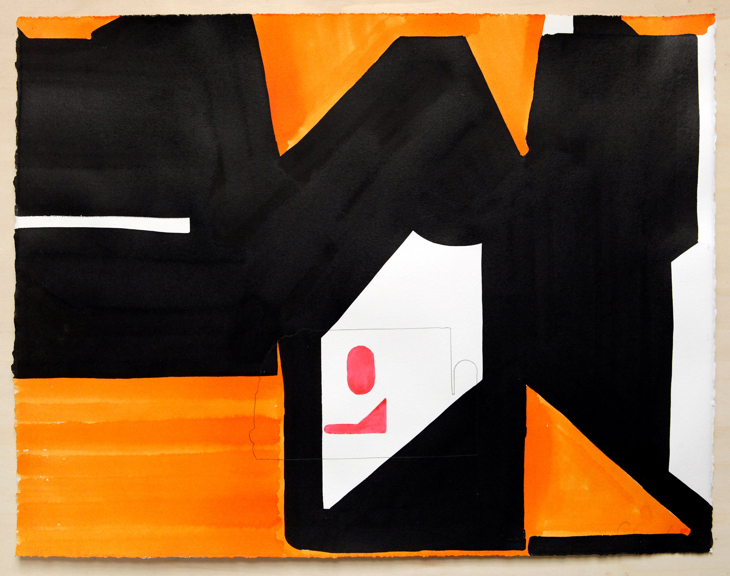
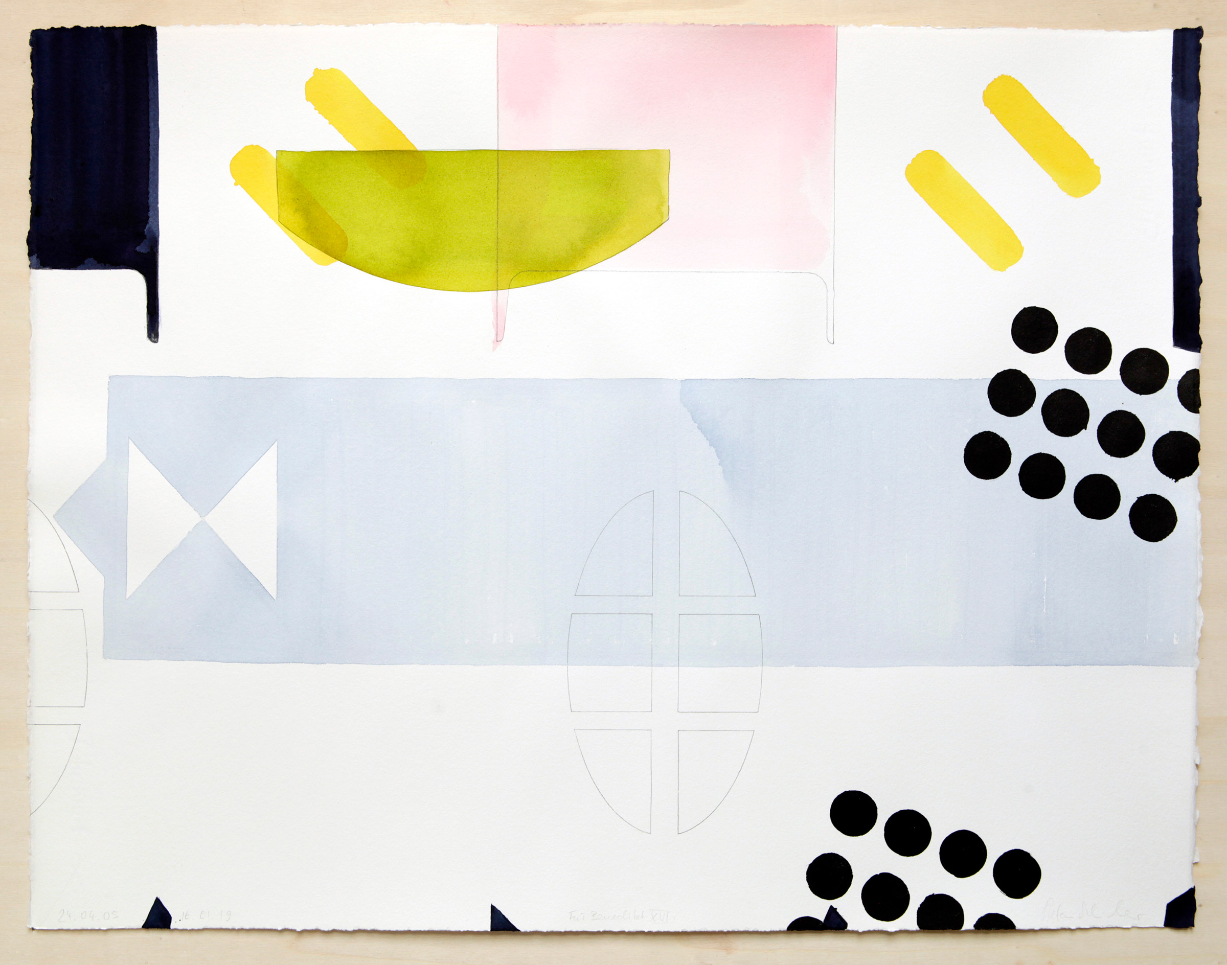
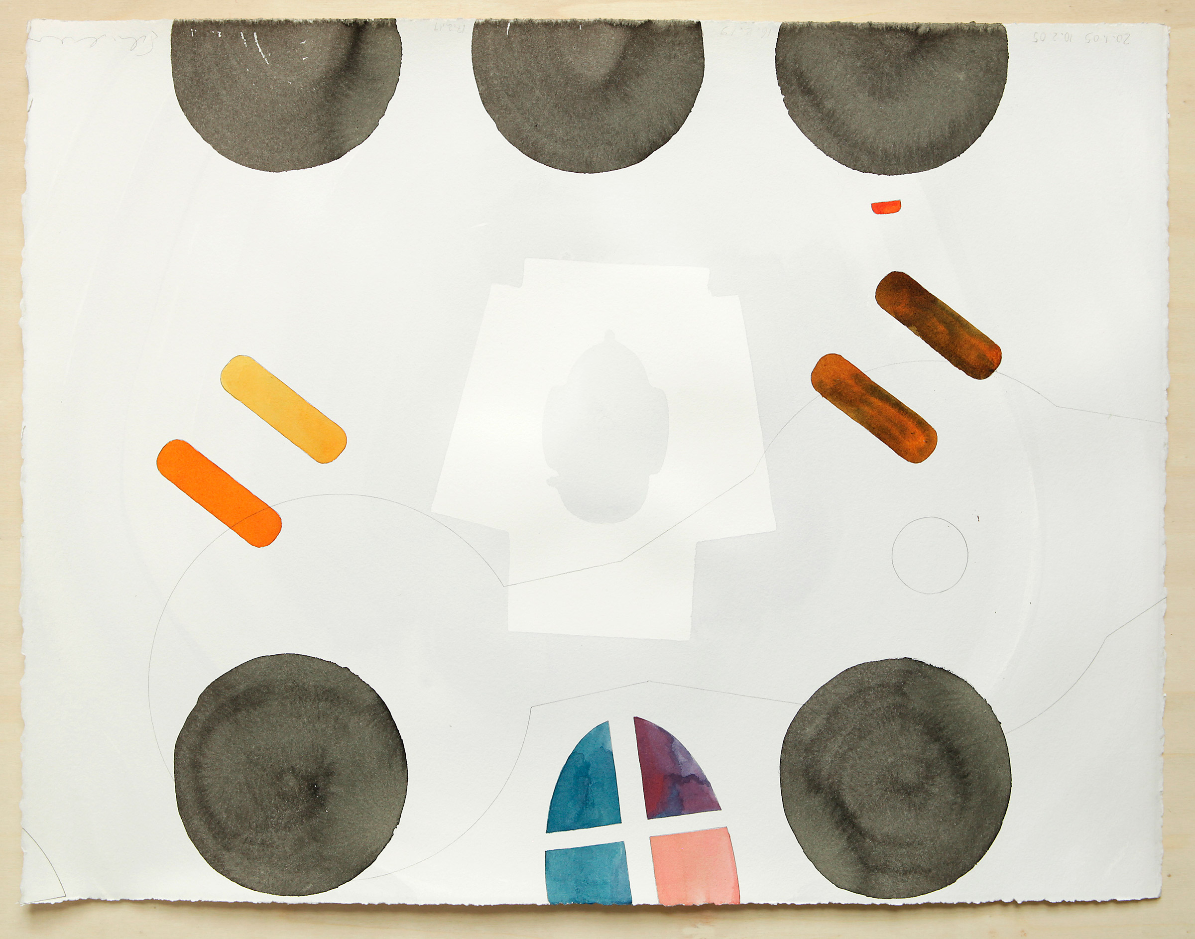
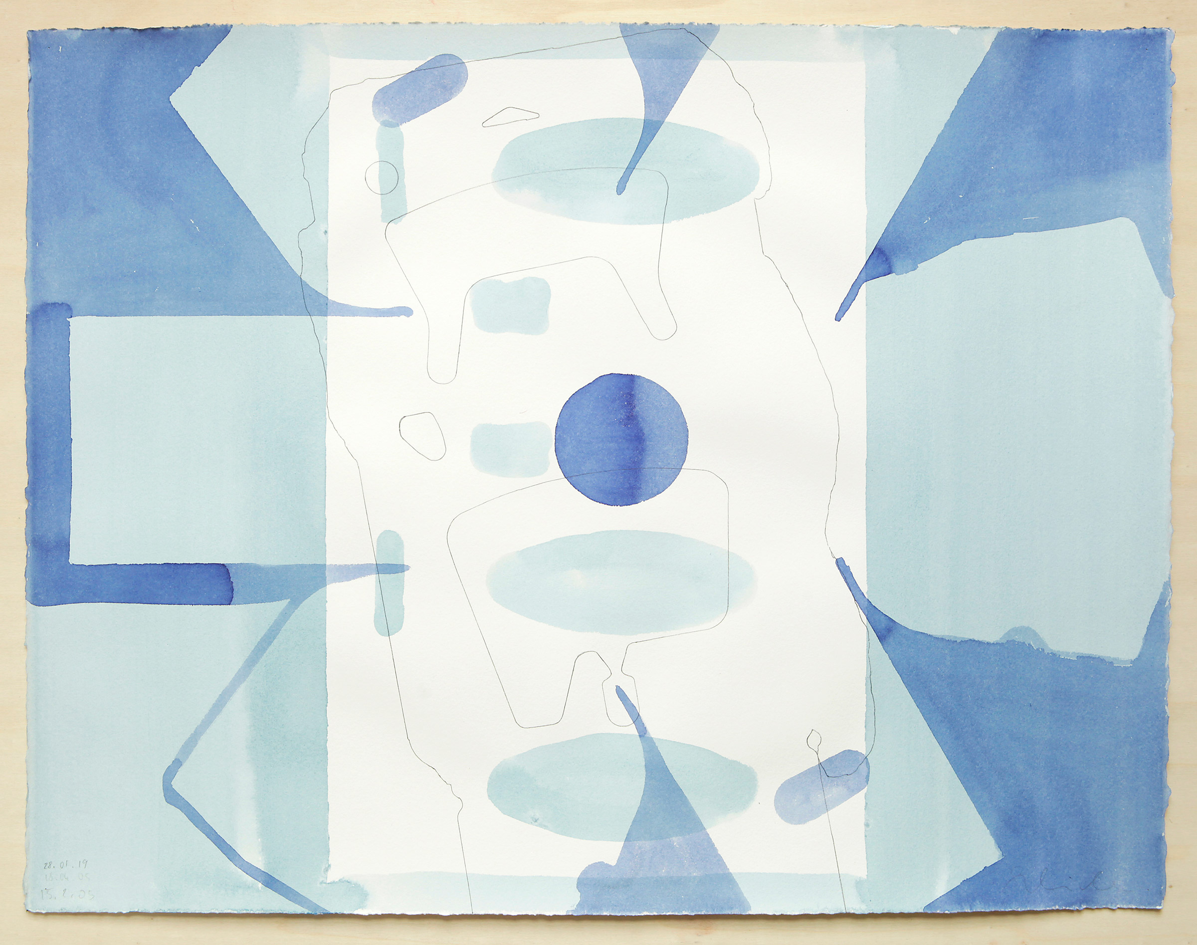
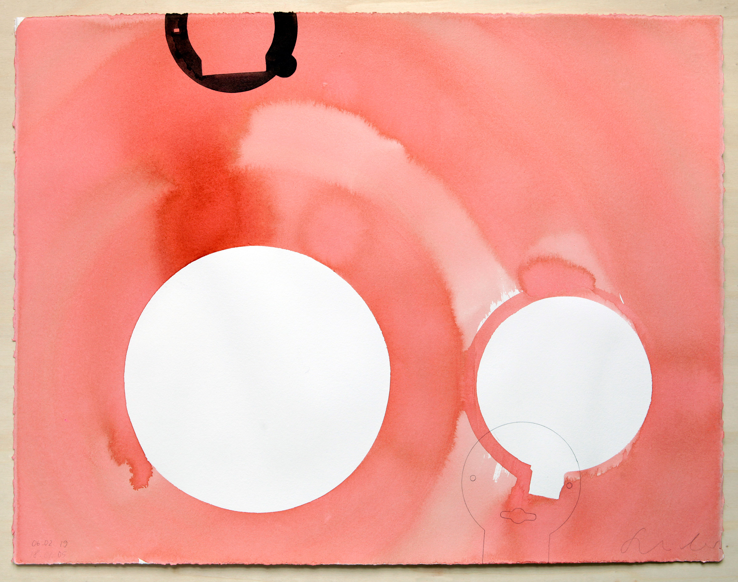
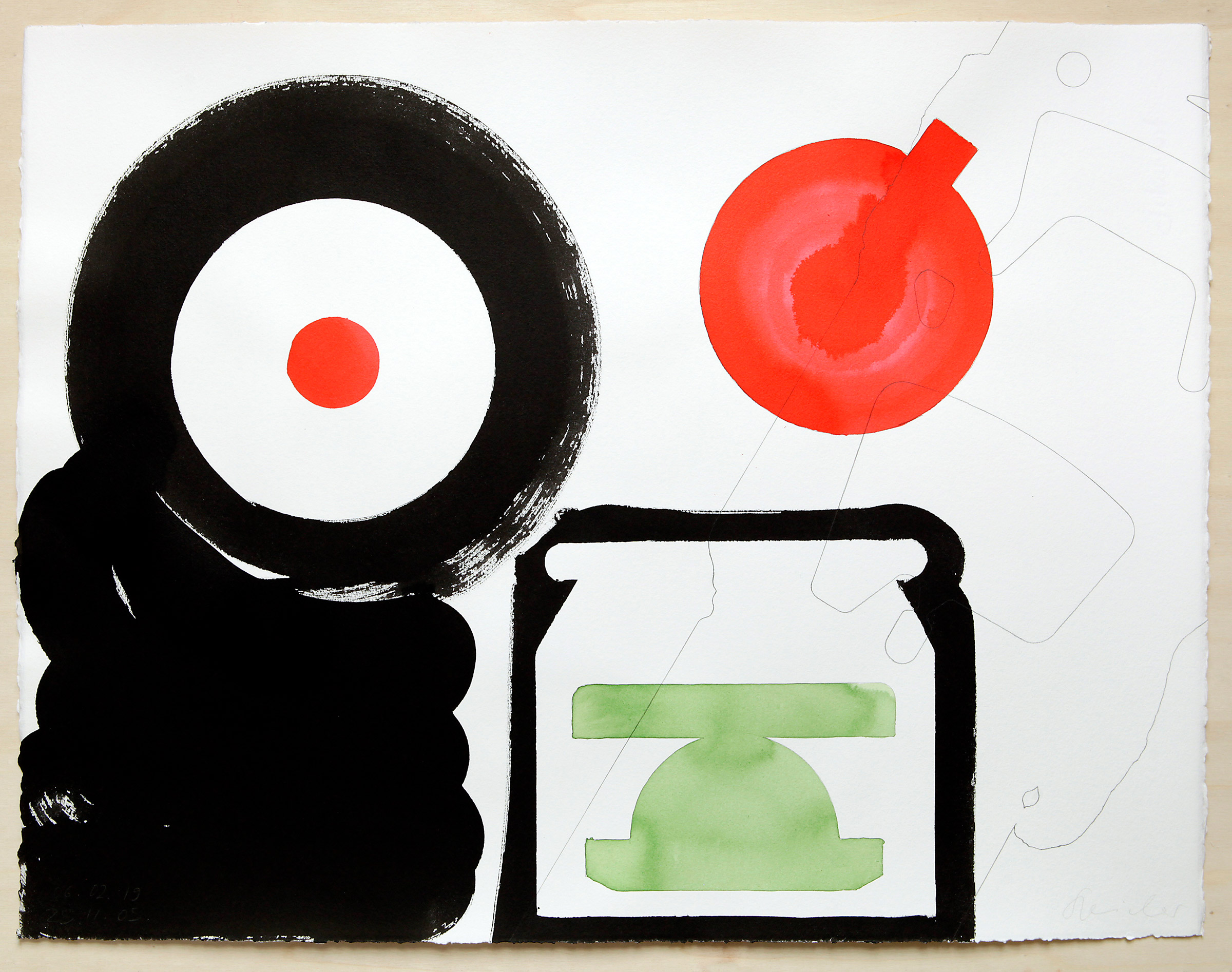
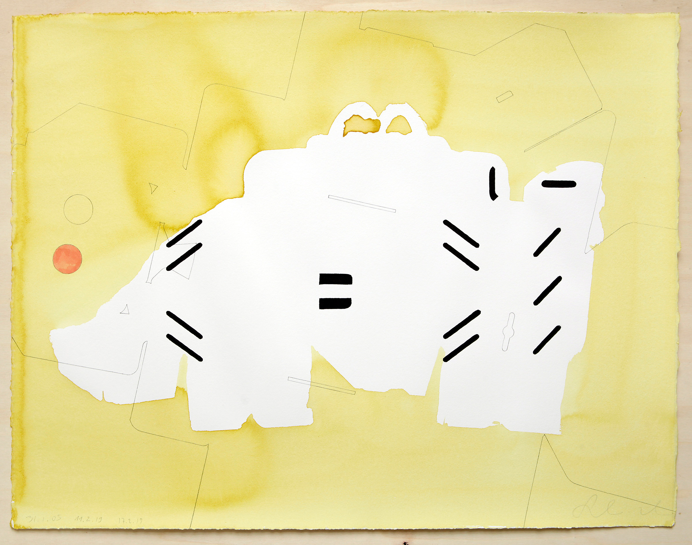
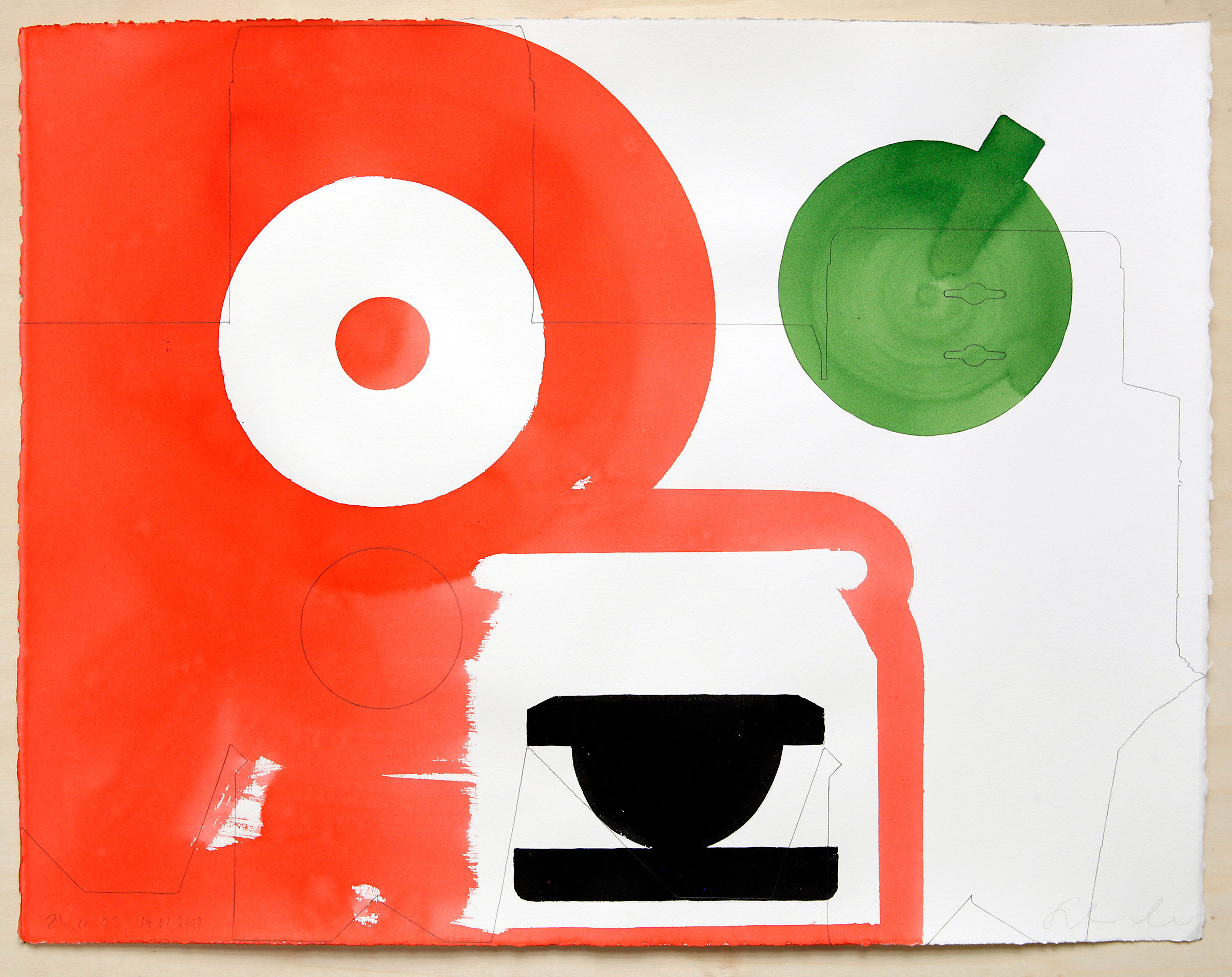
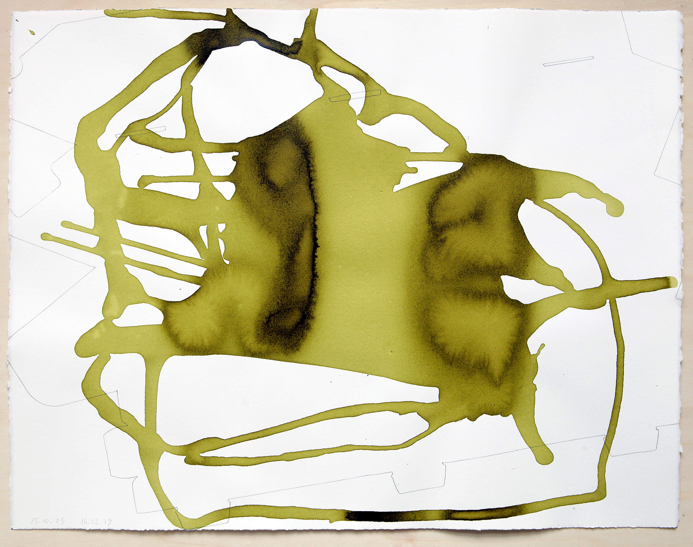
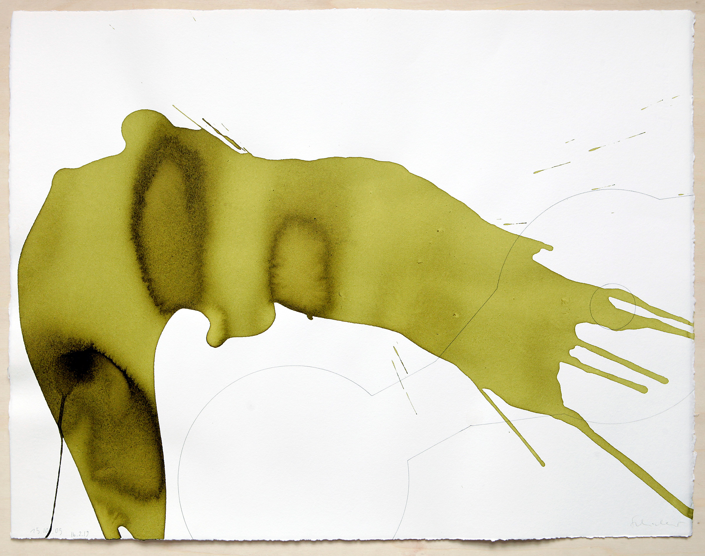
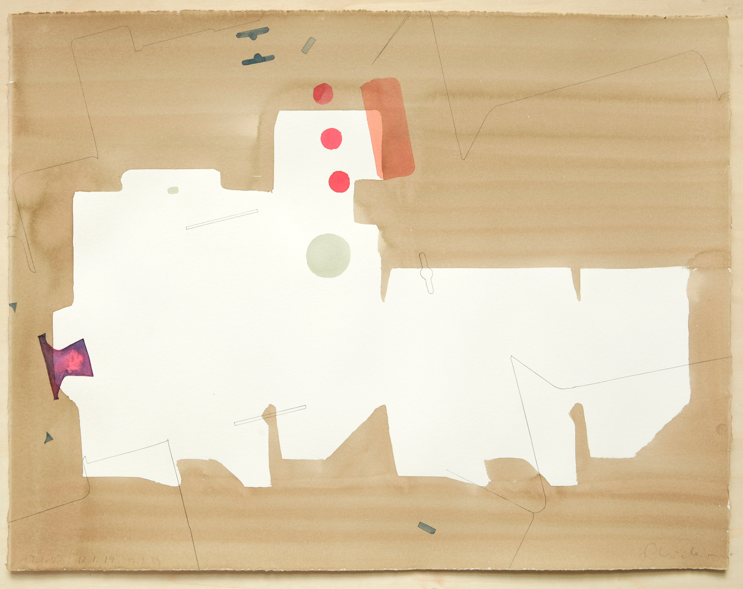
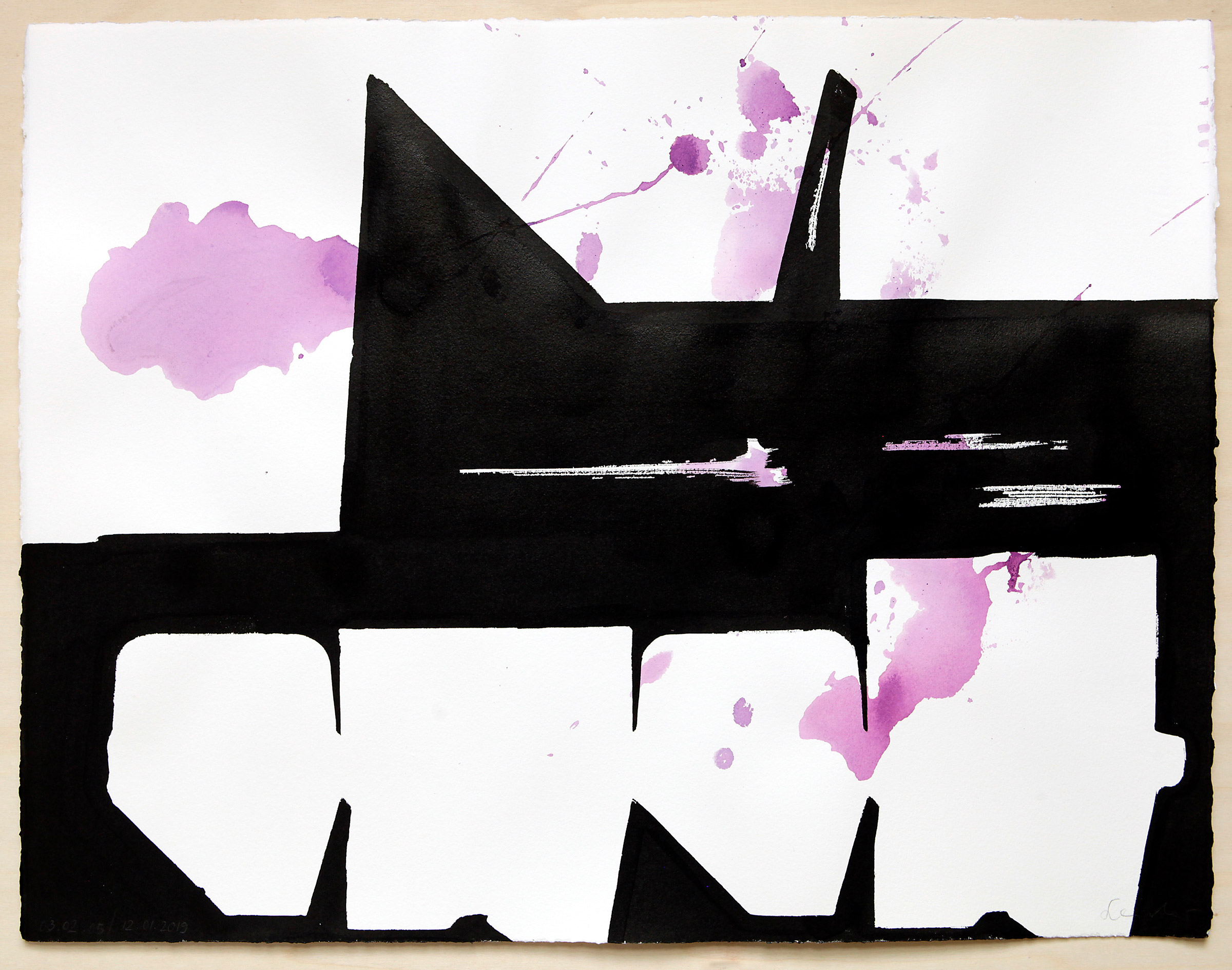
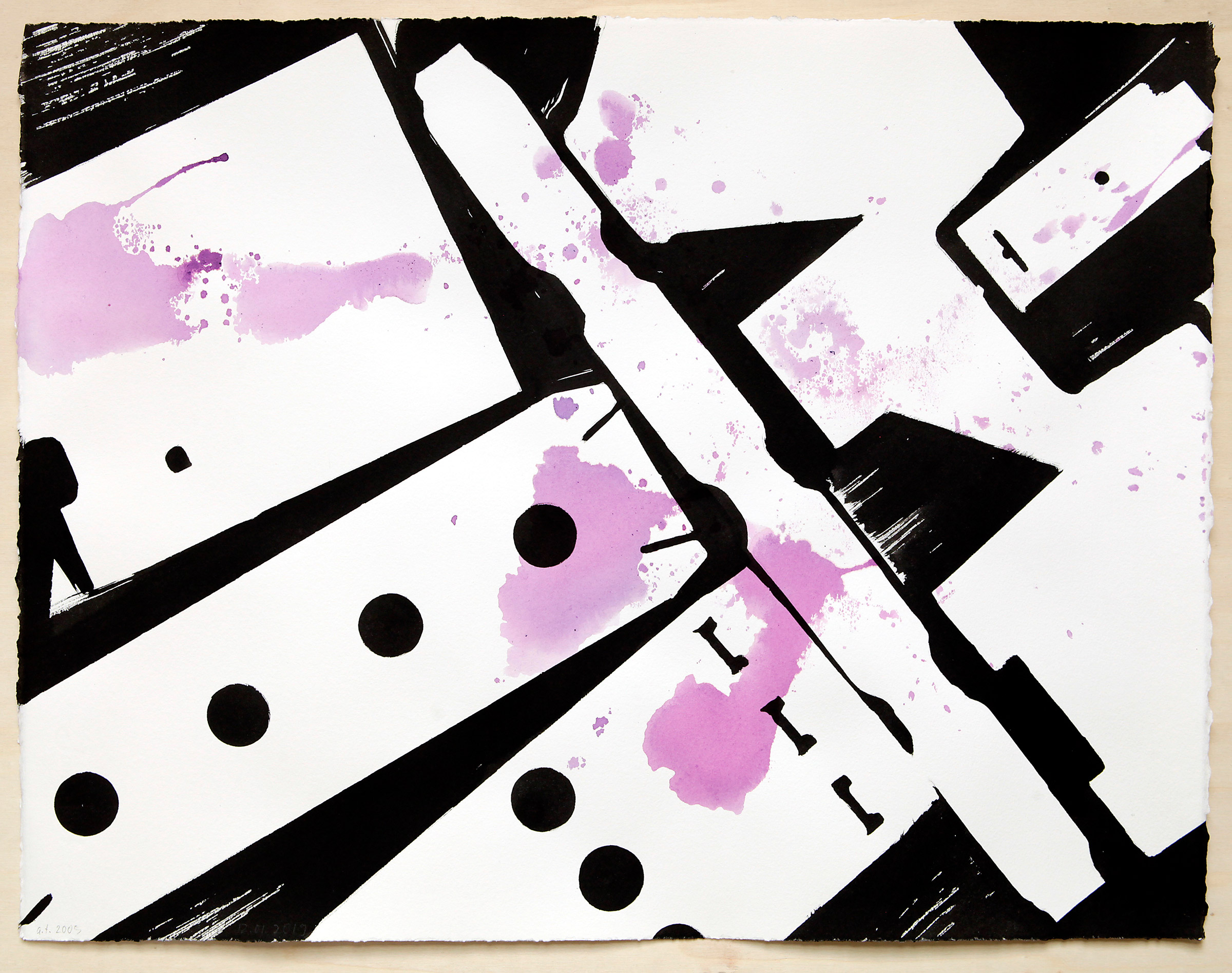
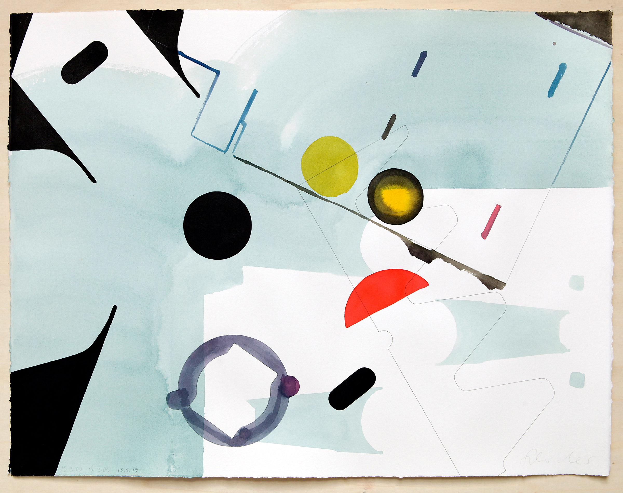
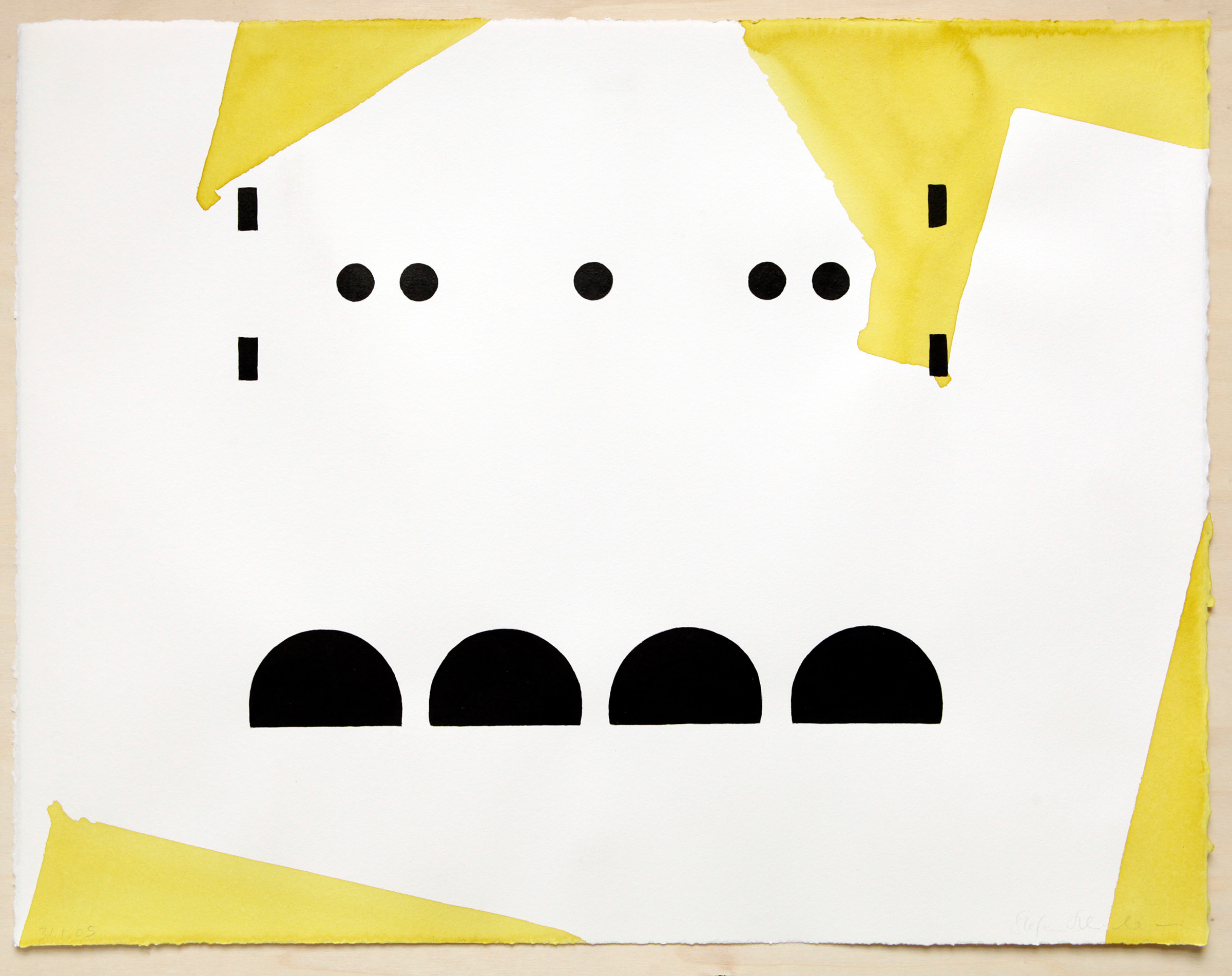
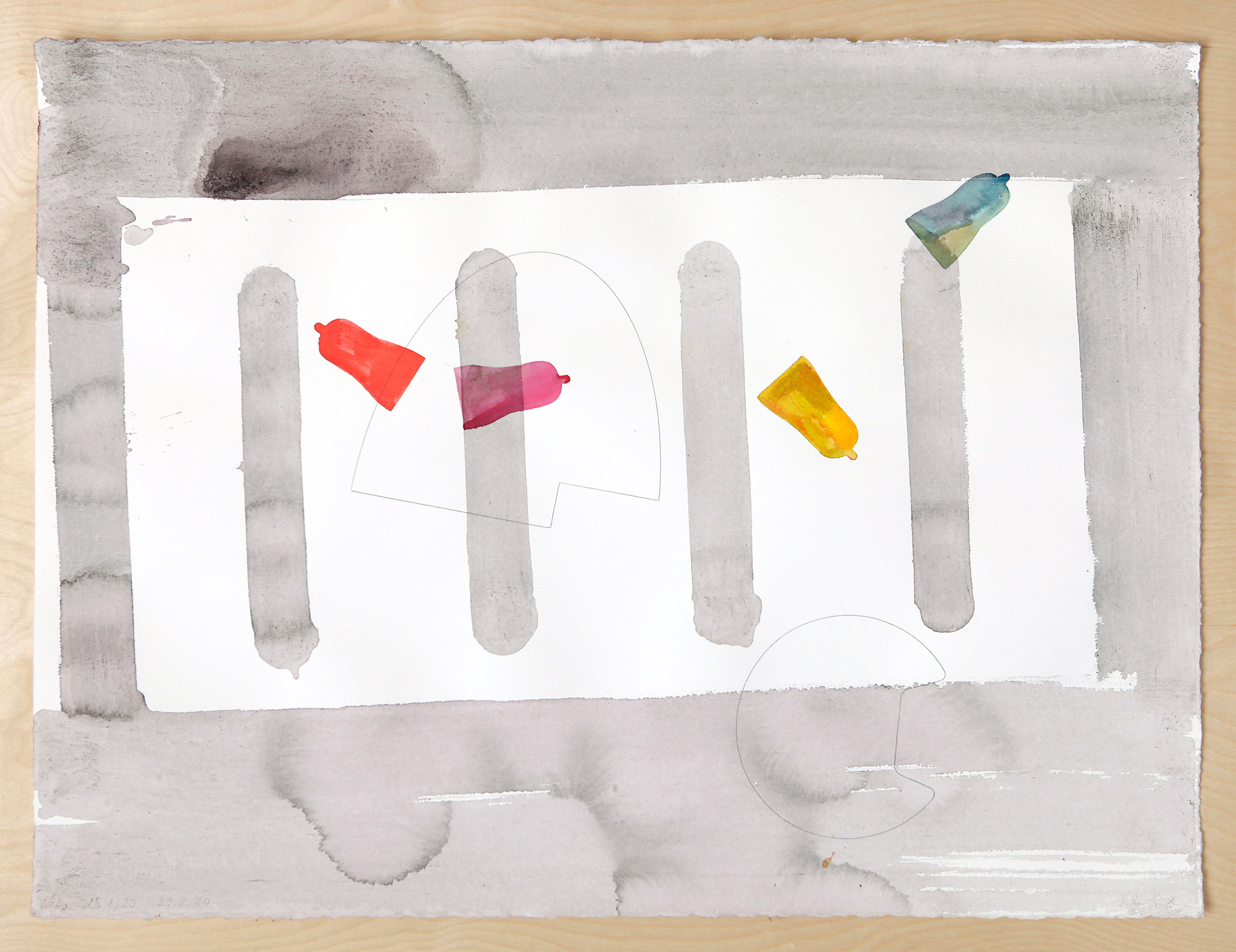
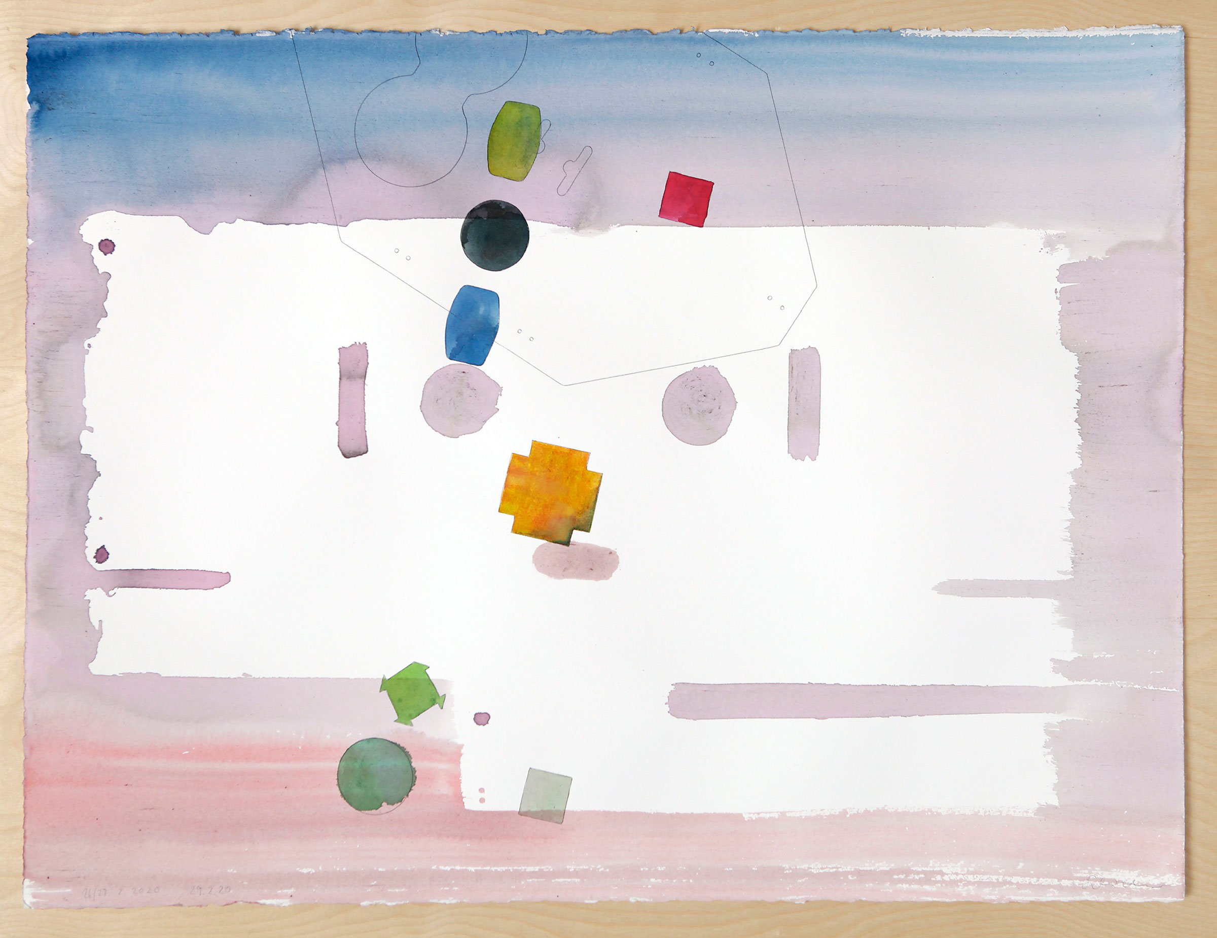
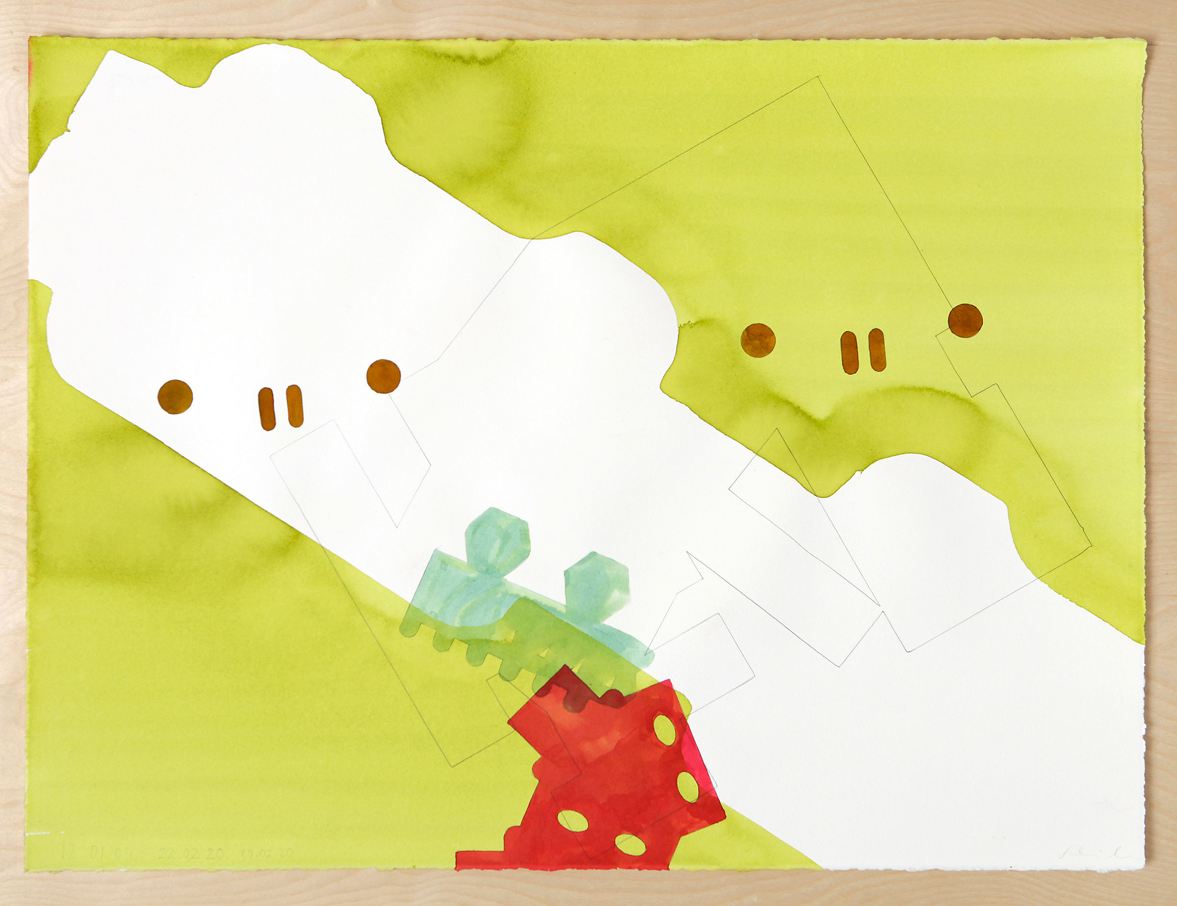
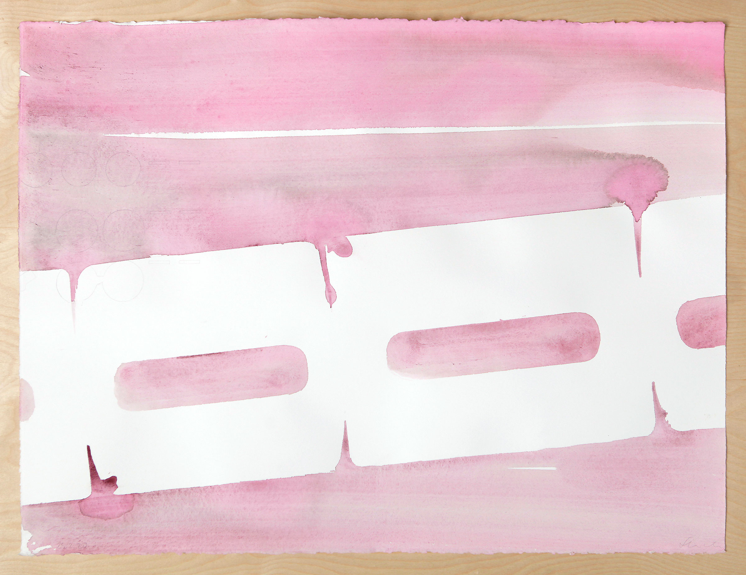
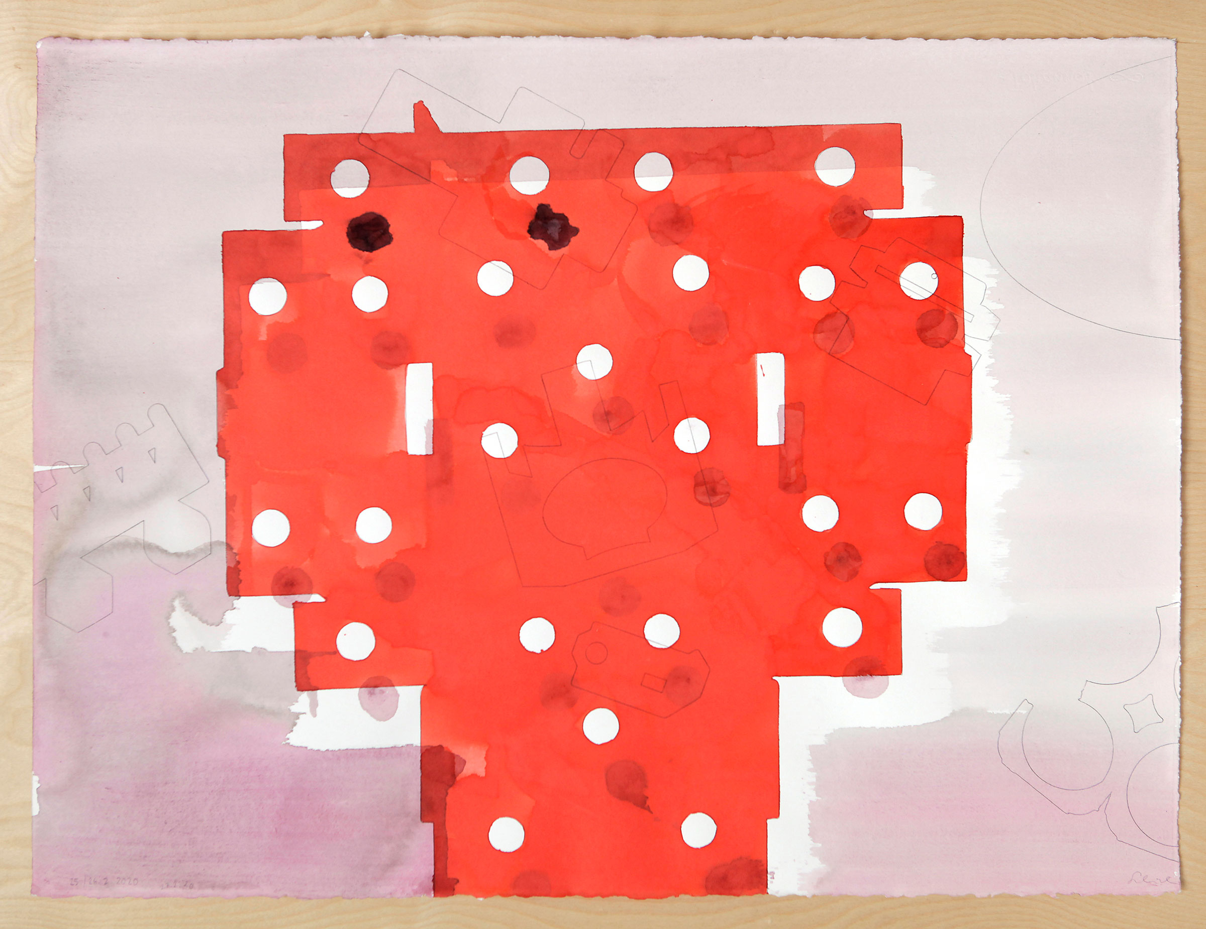
Title of work:
Common Alphabet
Place: artist studio
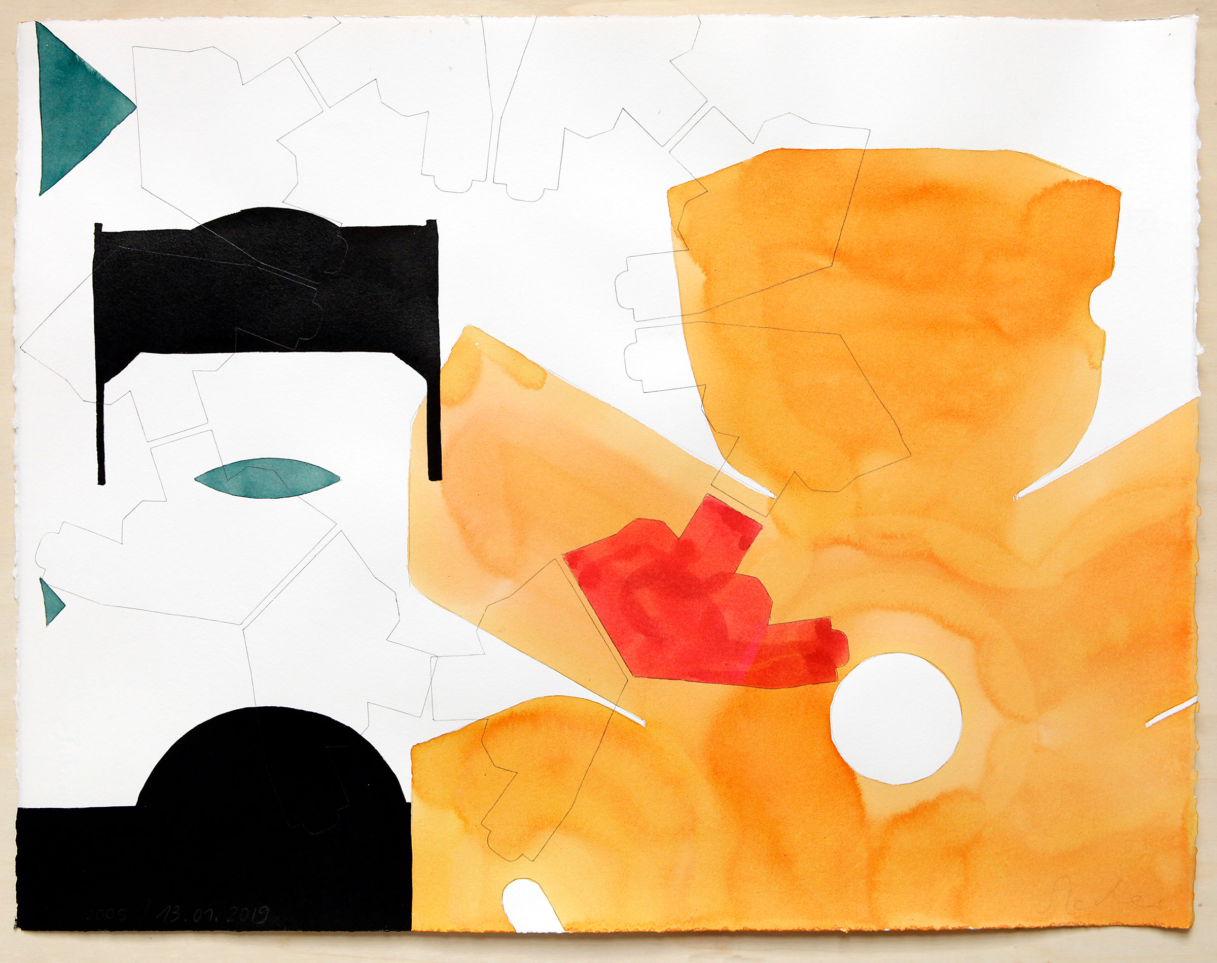
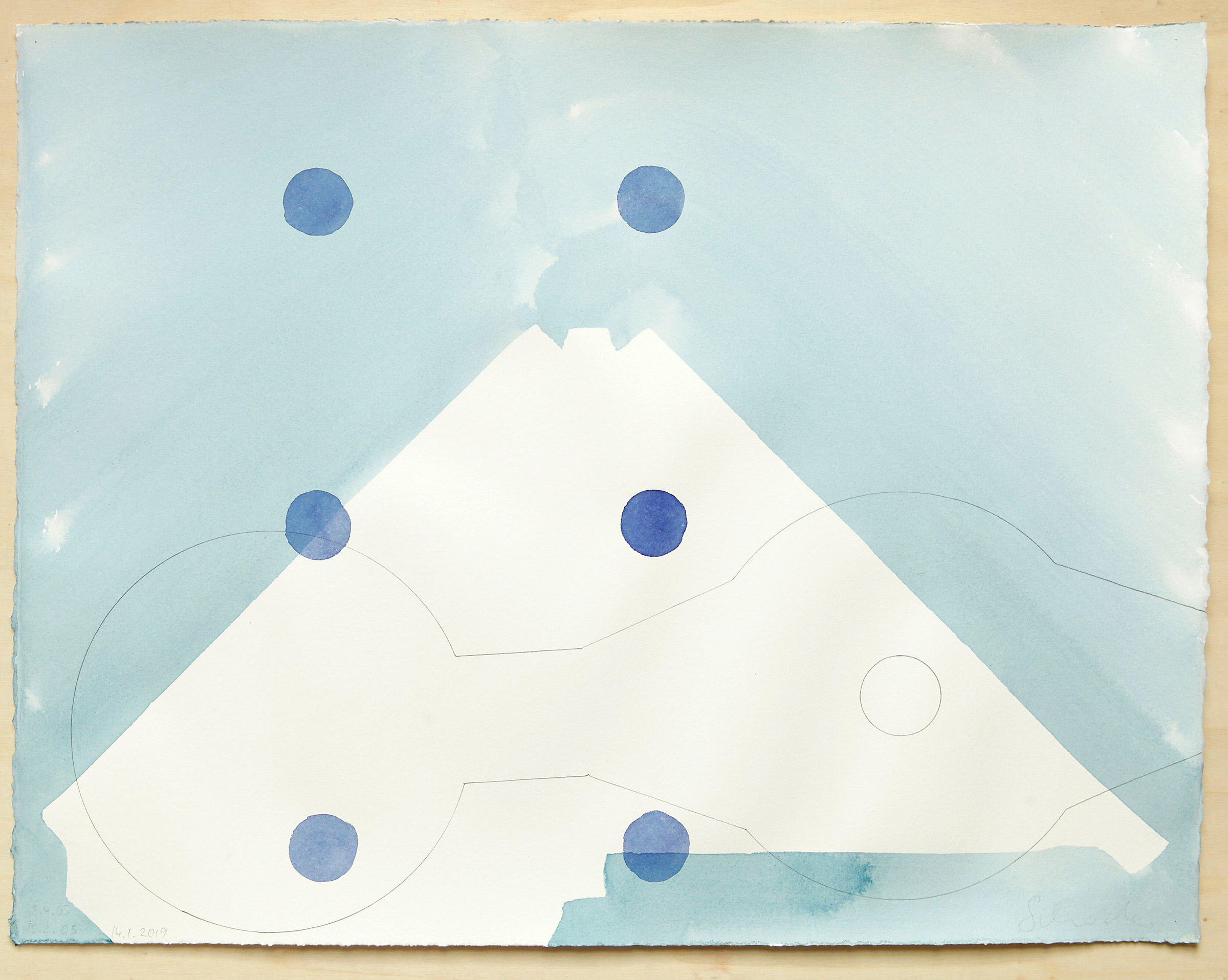
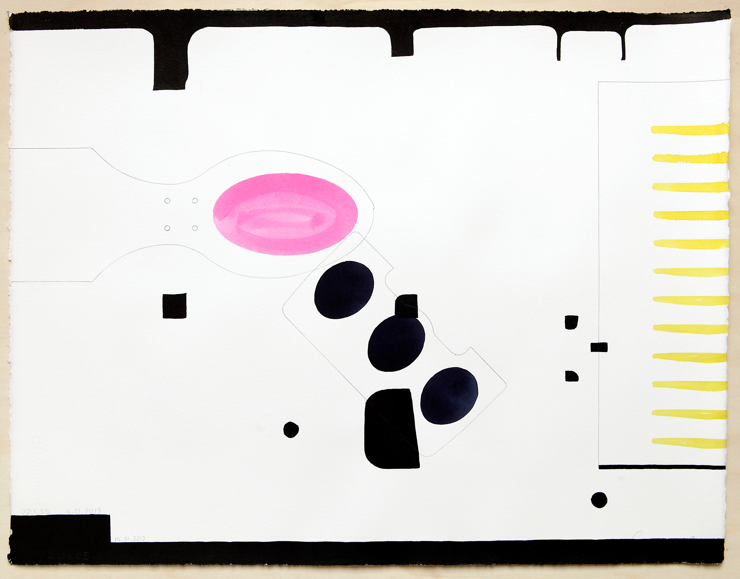
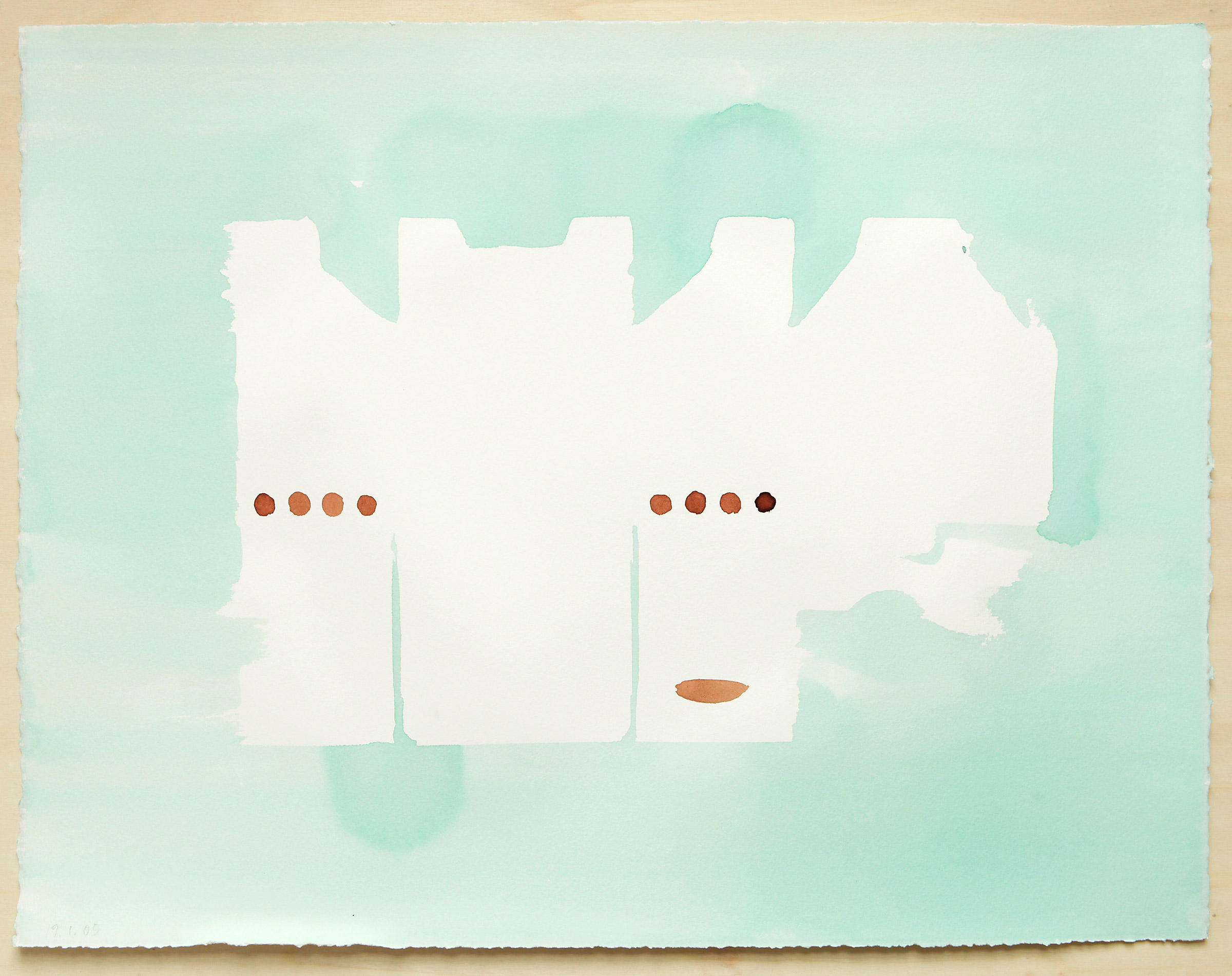
Technic: coloured shellack ink and colour pencil on handmade paper
Size: 57 x 76 cm (no.1-6) and 50 x 65,5 (no.7-35)
Year: 2002 – Ongoing
Photo: Stefan Schröder
Text: Stefan Schröder
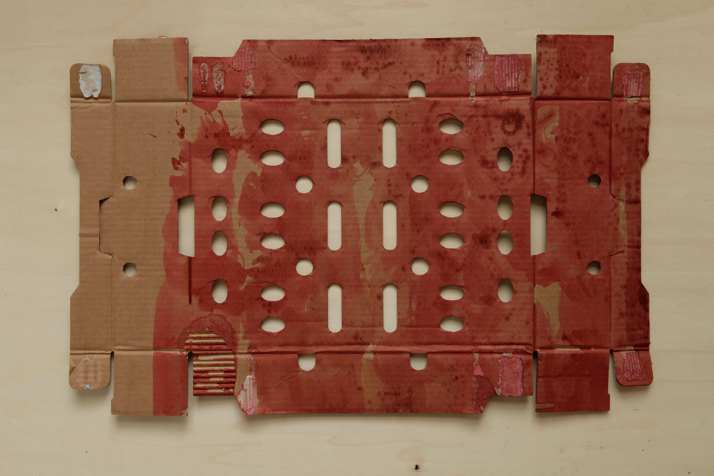
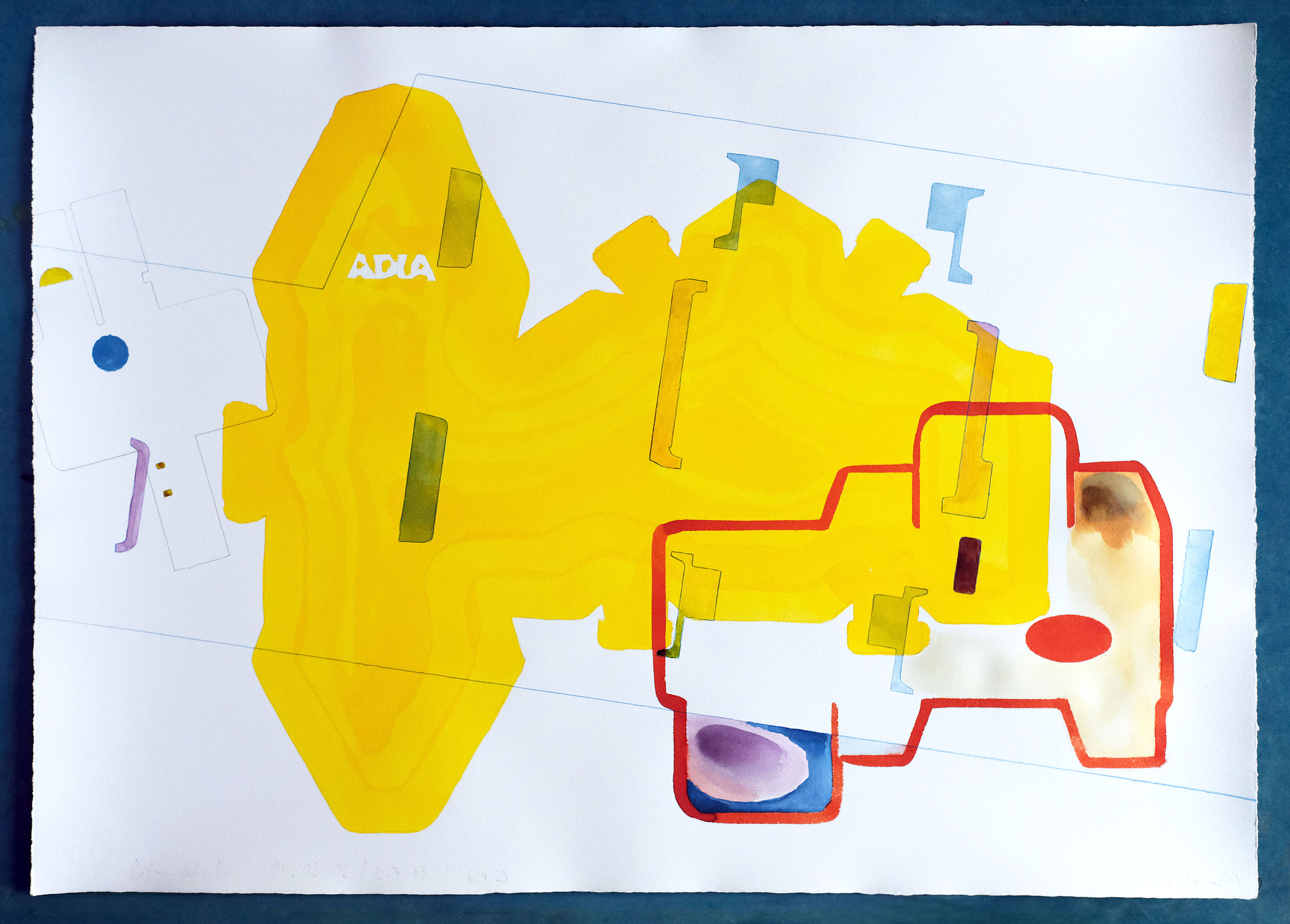
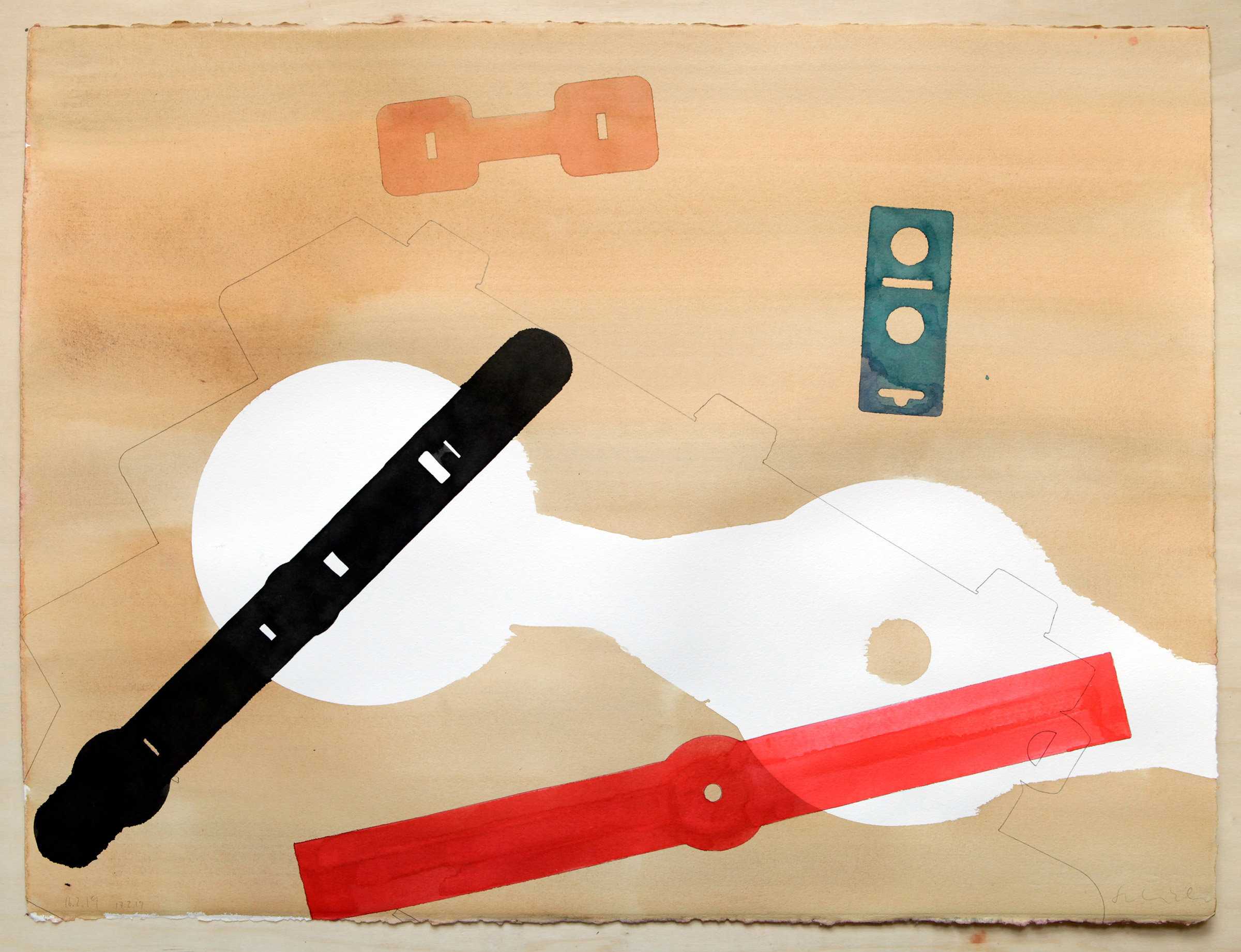
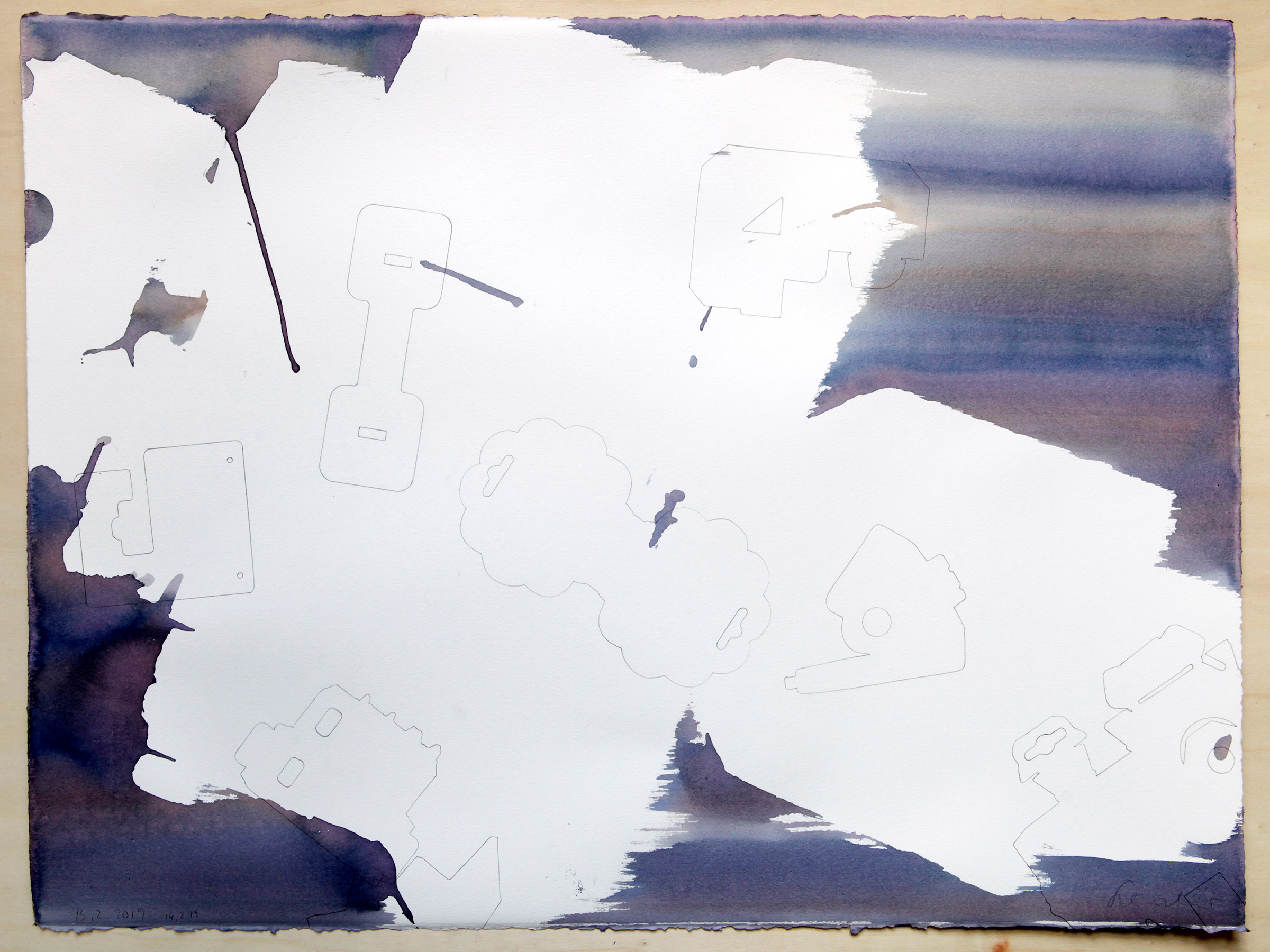
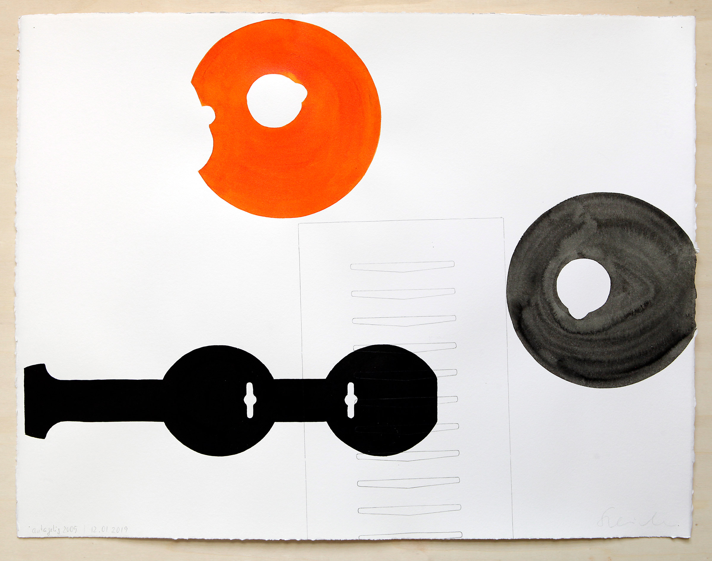
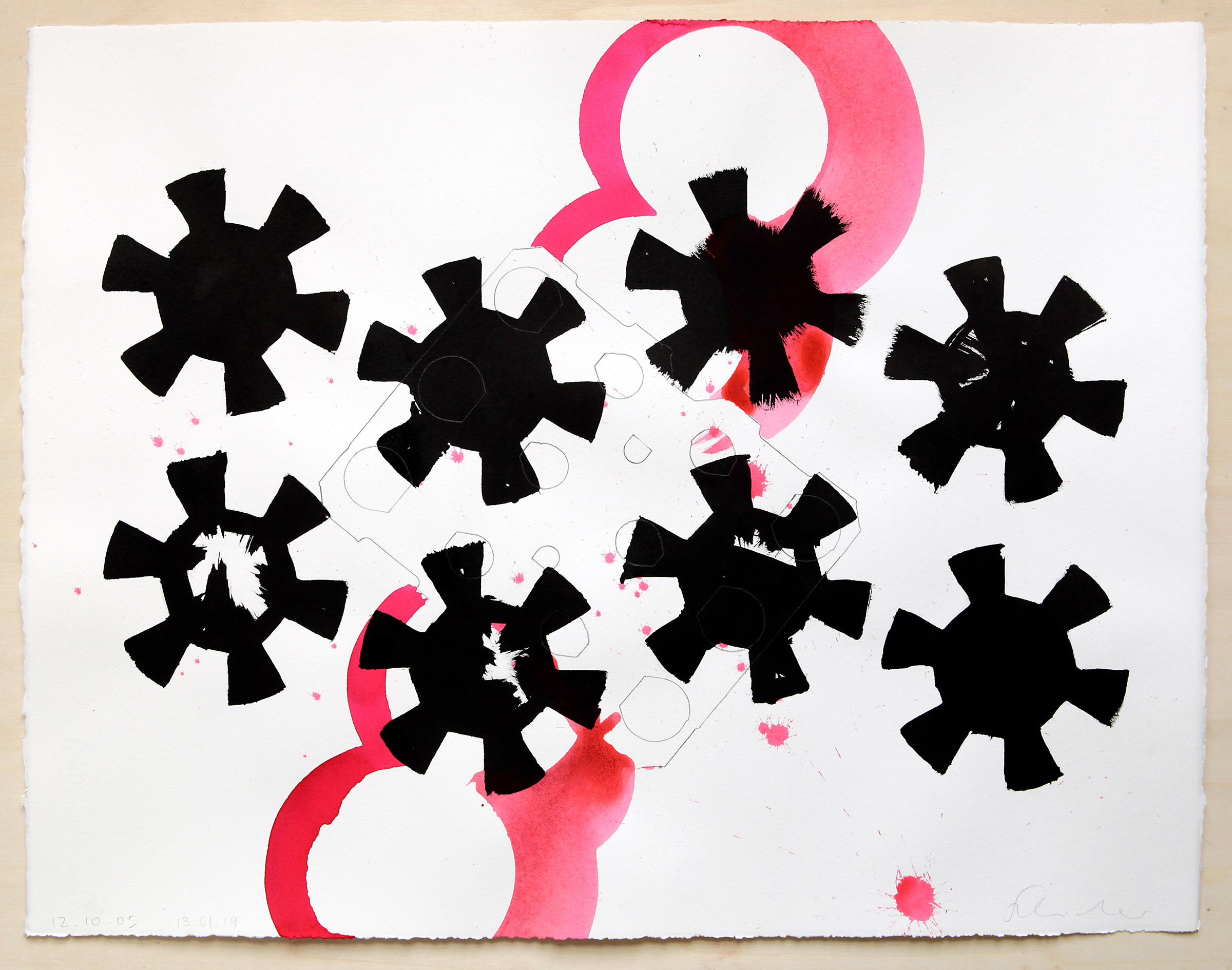
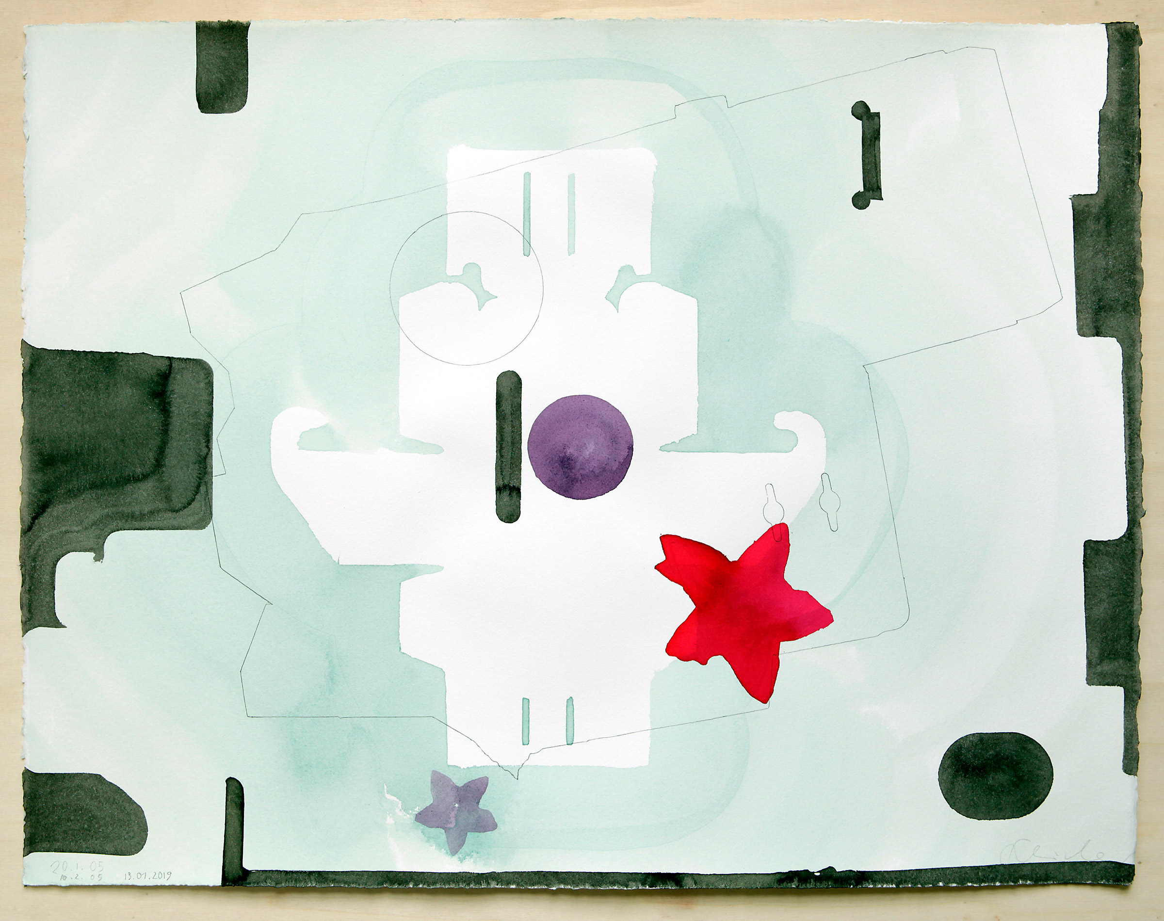
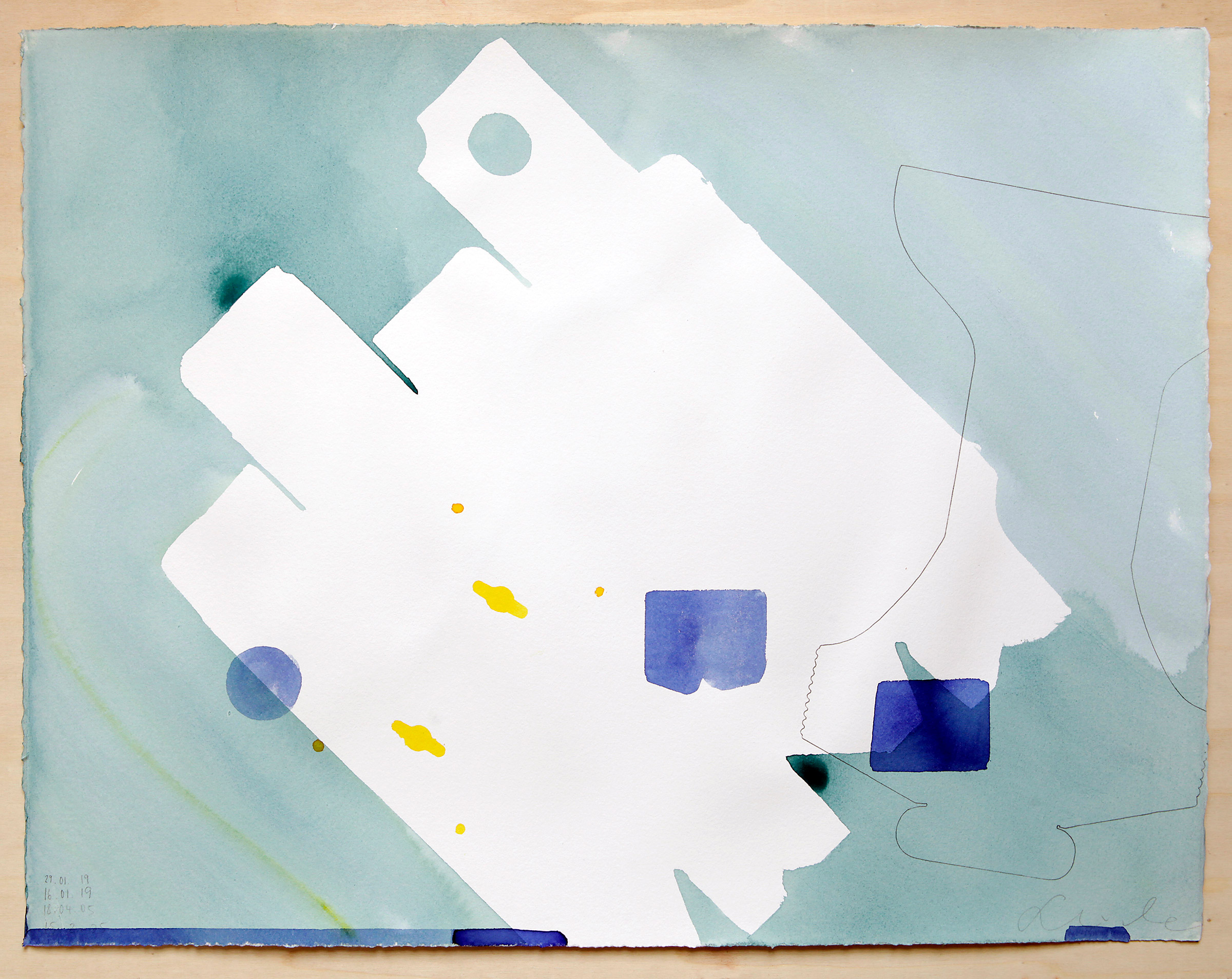
Drawings from the Common Alphabet series are the outcome of a long work process that began in 1992, my final year at the art academy in Dresden. In that period, I discovered the immense variety of forms used in the industrial packaging that comes with many of the products we purchase in what was the new world of Western consumerism. I started to collect packing wherever I got hold of it. During my postgraduate studies in the Nederlands, I decided to explore this rich world of aesthetic form and its visual symbolism in a series of 60 black and white paintings (1994-95). In 2002, when I started to use coloured ink in combination with packaging as stencils, my approach changed from a more narrow and straightforward black-and-white aesthetic to drawings similar to calligraphy. My brush follows the stencils, but the ink often searches for its line away from the cardboard outline. This makes the drawings richer in detail and more vibrant in texture. The figures start to speak their language, though with the packaging stencil shape as the ruling grid.
Additional text:
Stefan Schröder – COMMON ALPHABET
by Susanne Altmann, Dresden
(first published in 2012)
Stefan Schröder has been writing drawings and paintings in a language he has developed and calls Common Alphabet since the mid-90s. He designs multi-part compositions from strangely familiar shapes, yet we cannot immediately ascribe an everyday experience to them. Schröder’s sign system is anything but common, and the viewer can enjoy ornamental shapes or organised chaos such as in Runestone, modern language type (2011) in an NY gallery. It is no coincidence that the title refers to an archaic alphabet that only experts can decipher today. Nevertheless, it accompanies the historic national identity of Nordic countries, including Norway. Apart from its use in scattered esoteric circles, the runic language has died out. It draws its current artistic fascination from its graphical density and the aesthetics of half-weathered stones in the landscape. The messages of the scripts, whether they are now a magical formula, a religious or historical document or simply a mundane attestation of love, remain obscure without scholarly guidance.
We should look at the Runestone from a similar perspective: it lays or stands on a stylised sandy base, arched over by darkness, and its texture recalls traces of weathering on an irregular rock. Instead of runes, it is covered with letters from the Common Alphabet and offers riddles such as the decoders of cuneiforms, hieroglyphs, and rune encounters. The Runestone symbolises the projection screen for myths that grew from the information Runestones originally conveyed to their contemporaries. However, with the addition of common, the artist gives us a key: The solution must lie in our everyday life and have a global aspect. And what connects our world more profoundly than consumer culture, as industrially mass-produced goods from Guangzhou to Portland, from Naples to Narvik? Stefan Schröder’s fund of forms is not an invention but a discovery.
It is standard cardboard packaging that we handle daily. We unwrap something, get annoyed about the waste of materials and delegate the remains to the waste bin to disappear. Not so with Stefan Schröder; he carefully unfolds and examines the boxes. His series, Common Alphabet, is a unique recycling service. There is packaging from wine glasses, bicycle locks, yoghurt pots, socks, pralines, duct tape, and various kinds of fruit, as well as a wealth of geometric shapes that belong to the world of production and usage. This relationship becomes evident when Stefan Schröder activates the boxes in his latest work, Vestavinden (West Wind, 2011), an outdoor piece for a Lista/Farsund commune school. The boxes, translated into aluminium, take on a three-dimensional life in the playground sculpture. They get caught in the branches of an abstracted tree and tell the story of this place and many of its inhabitants who immigrated to the United States during economic distress. Having achieved prosperity, they sent packages of coveted consumer goods back to their old homeland, Norway. Figuratively speaking, the west wind brought prosperity and left empty boxes behind as witnesses. Of course, Stefan Schröder’s preference for these abstract shapes betrays a love of construction and Constructivism. This becomes particularly evident when he presents individual templates on panels and thus moves in the direction of geometric abstraction or concrete art. However, as the construction itself is not carried out by the artist, it is more a demonstration of an intellectual proximity than the appropriation of a strategy.
Another relationship – if not primarily visual – is much more apparent. At Stefan Schröder, we meet Marcel Duchamp’s great-grandson at work. Stefan Schröder’s Common Alphabet is nothing less than a thinly veiled interpretation of the strategy of ready-mades. It is widely known that Duchamp was the first to declare a trivial everyday object as art and thus triggered a revolution in 20th-century art, a revolution without which objective art and installation would be almost unthinkable. They are not necessarily Stefan Schröder’s media, yet the everyday object, here as a copy of its packaging, is in the spirit of Duchamp’s multiple image motif, particularly through the Common Alphabet. When asked how this title came about, Stefan Schröder explains that these neglected cardboard boxes are a worldwide system of signs.
While no spoken language exists for this alphabet, its information content is global and universally understood once one opens up to it. The Common Alphabet does have a code, and the key to it exists, even if no one is particularly interested. With his work, Möglichkeitsfeld (Field of Possibilities, 2010), Stefan Schröder again plays with the cryptic potential of his signs. He made two screens of the Common Alphabet in the staff restaurant of the largest German research centres (Helmholz-Zentrum Dresden-Rossendorf) that deals with high-frequency magnetic fields, particle accelerators and radiopharmaceuticals. Here, his elements incorporate the visual models of scientific experimentation and thought structures between chaos and order, rationality and intuition. Both fields evoke a possibility to creatively decode sign systems and the diverse forms of coding behind them. Here, however, as in Vestavinden, Stefan Schröder, as well as a practitioner of site-specific and public art, proves to be a practitioner who understands how to think with the art user and open up new horizons. In the literal sense of the word, he offers such a horizon incidentally in his latest work, Lørenskog Stars (2011), in the stairwell of a new cultural centre in Lørenskog, near Oslo. Although he does not refer back to the accepted sign language of Common Alphabet, he again chooses a moment of yet to decipher readability. The bird silhouettes that populate several levels of a steel mast topped by lights and remove the barrier between inner and outer spaces appear from a distance like black notes on a vertical score: again, further information behind the visual layer. Stefan Schröder thinks of this aleatoric musical piece as a tonal equivalent of graphics.